Portfolio project
Remodeling a family home in Bærum

Thibaut Devulder

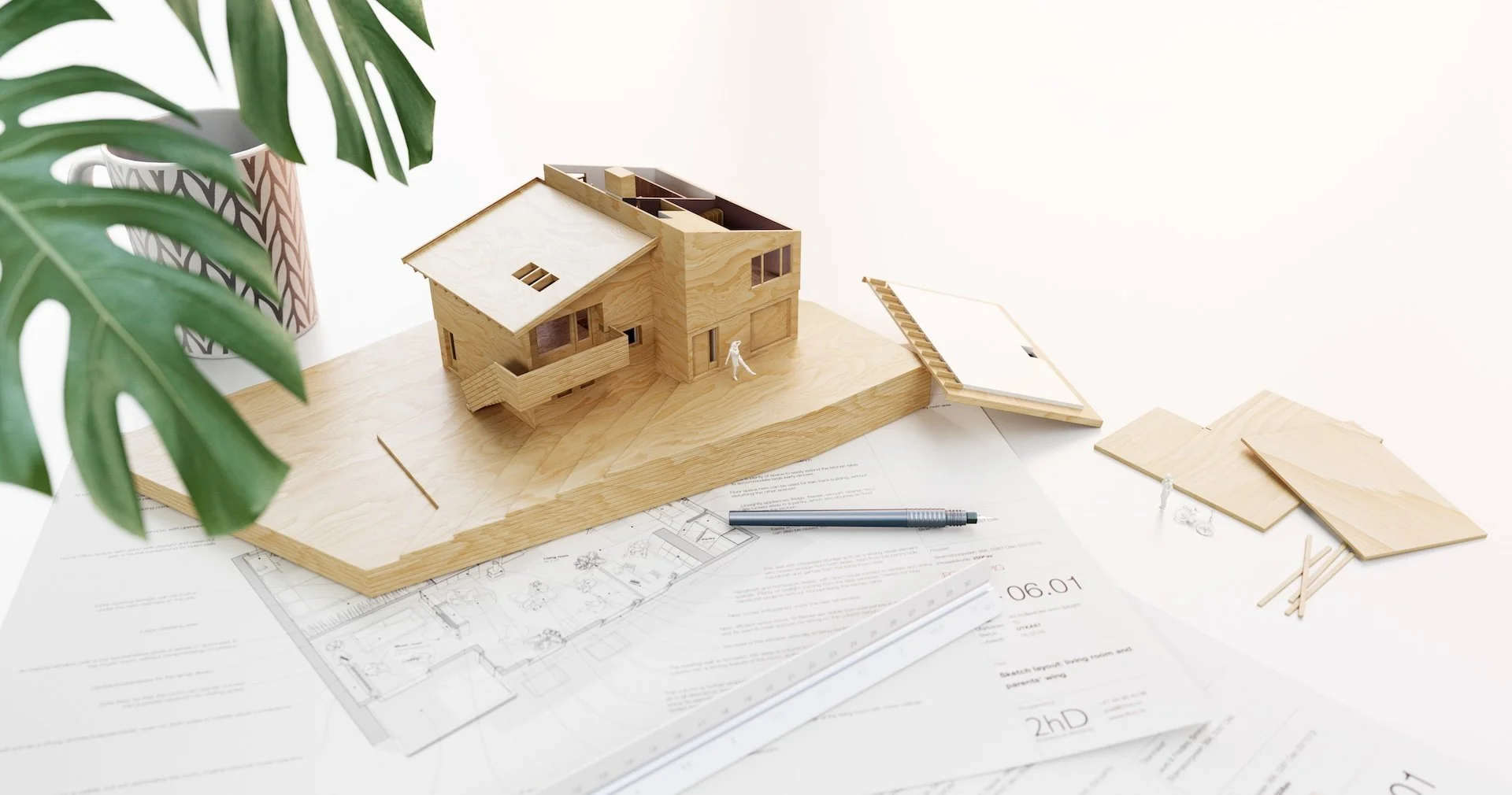
We have just finalised the design for the remodeling and extension of a family house in Bærum, near Oslo. The detailed drawings package has now been sent to potential builders and, before construction starts this spring, we would like to share some of the ideas behind our design approach.

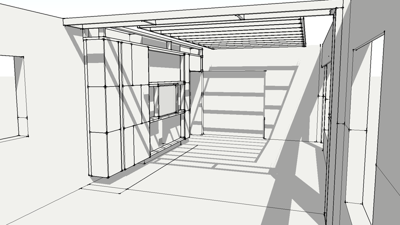
Sketch view of the redesigned home, approaching the new entrance

About our clients

Our clients, a young Norwegian couple with a toddler, had purchased a derelict detached house in the neighbourhood of Gjettum. The existing house had been divided into two rental apartments, one on each floor, connected by a shared entrance staircase.

Their plan was to merge these two floors into a single family home, where they would live and host frequent gatherings with their large extended family. The structure and footprint of the existing house was to remain mostly unchanged, but its fabric upgraded to meet modern environmental standards. Our clients were also considering the option of accommodating a rental apartment within the house, to create some additional income until they needed the whole house for their growing family

The existing house

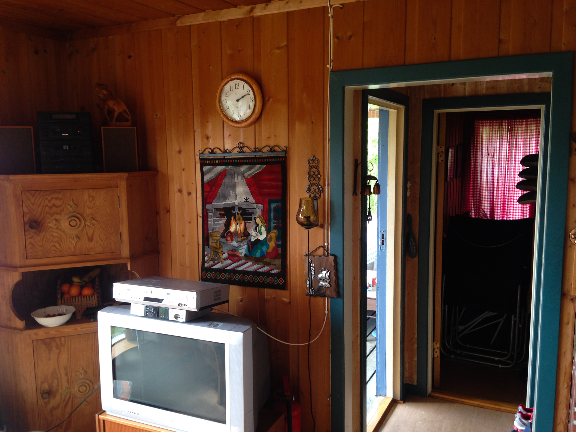
The general feeling of the existing house was somewhat claustrophobic: the redundant spaces created by the two identical floor plans, the small cellular rooms and window-less corridors, the few oversized windows... All contributed to the impression of undersized spaces. A large garden surrounds the house but this was completely disconnected from the interior. It was also mostly spoiled by a garage and a long driveway to the south boundary of the site, which made the approach to the building unwelcoming.

Floor plans of the existing house (click for full view)

The existing house, viewed from the street approach
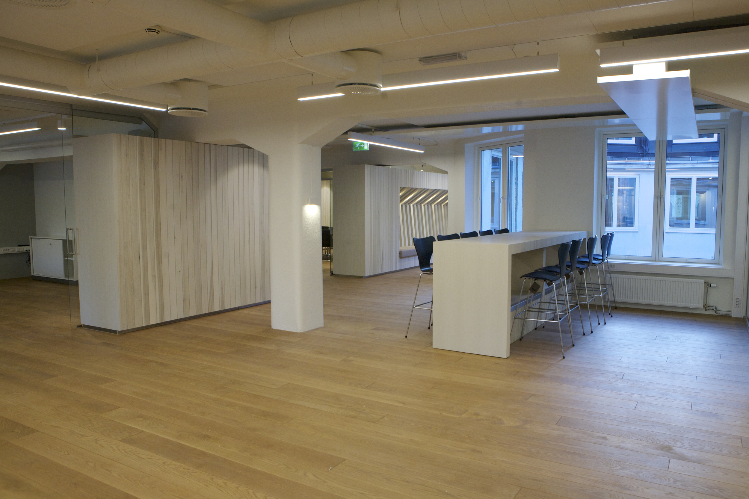
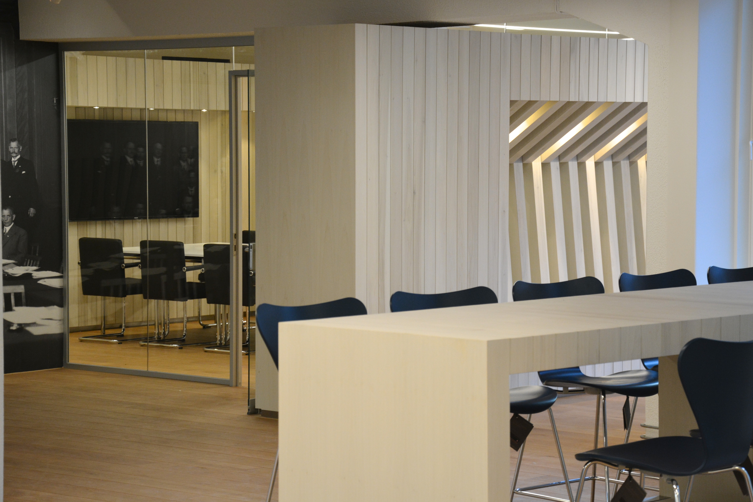
Our design strategy

An obvious solution would have been to extend the house to open up the main living spaces. However, as in many of our projects, we focussed on making the most of the existing building. Key to this approach was to reconnect the various living spaces — both interior and exterior — so that the different architectural functions could flow into one another.

Our design strategy, as presented to our clients during the sketch design phase. Drawn on top of the floor plan of the existing house (click for a full view)

Connecting the social spaces

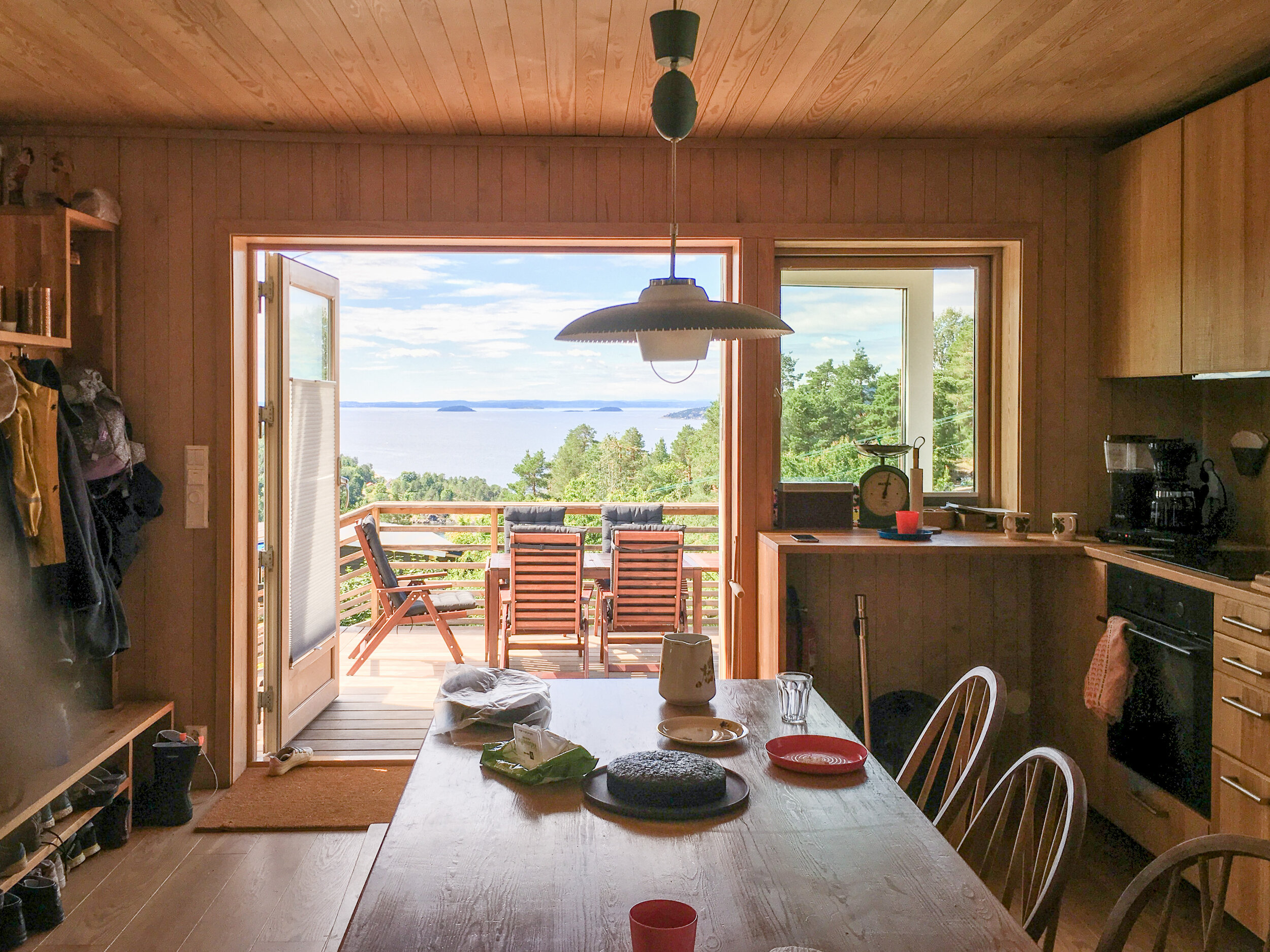
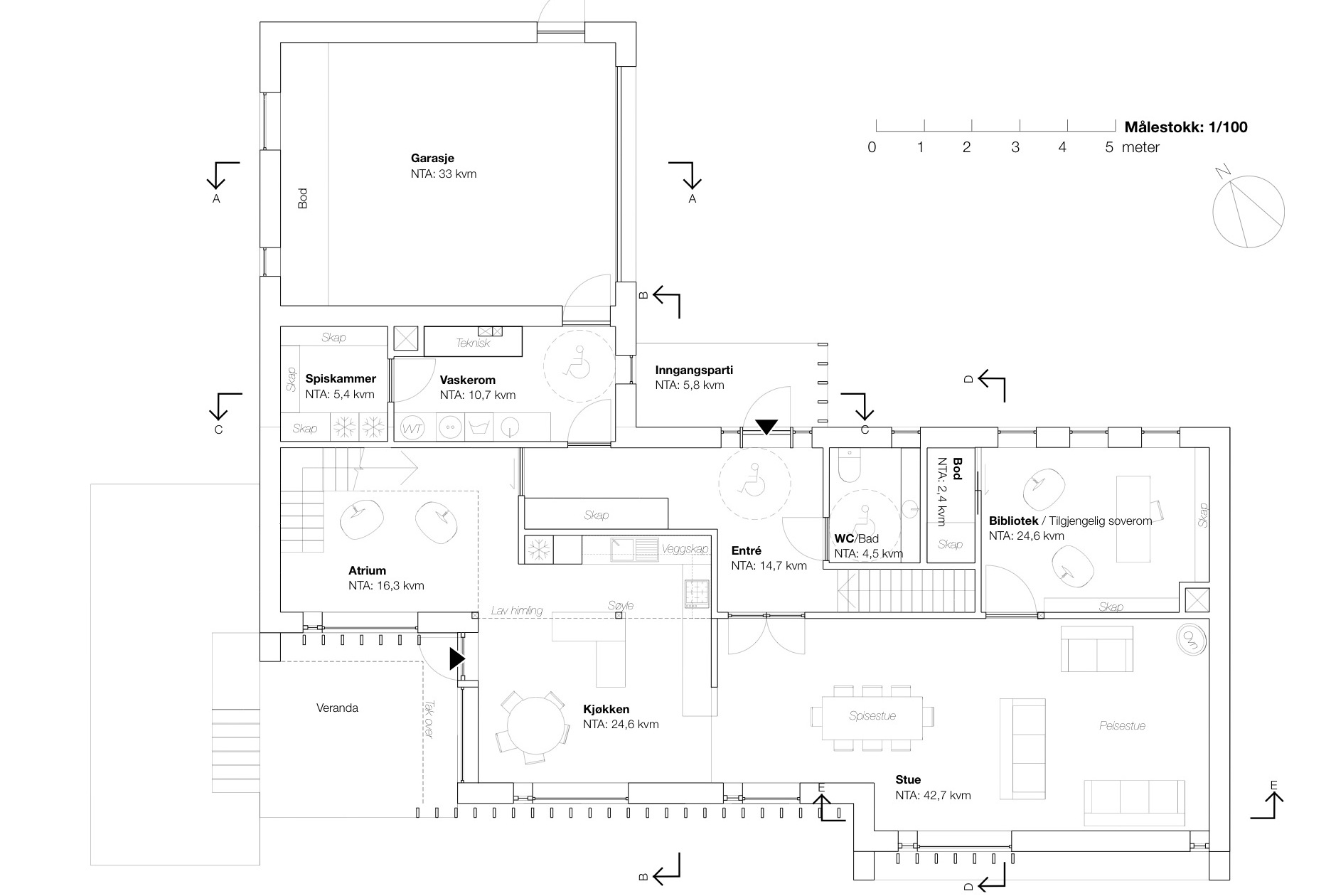
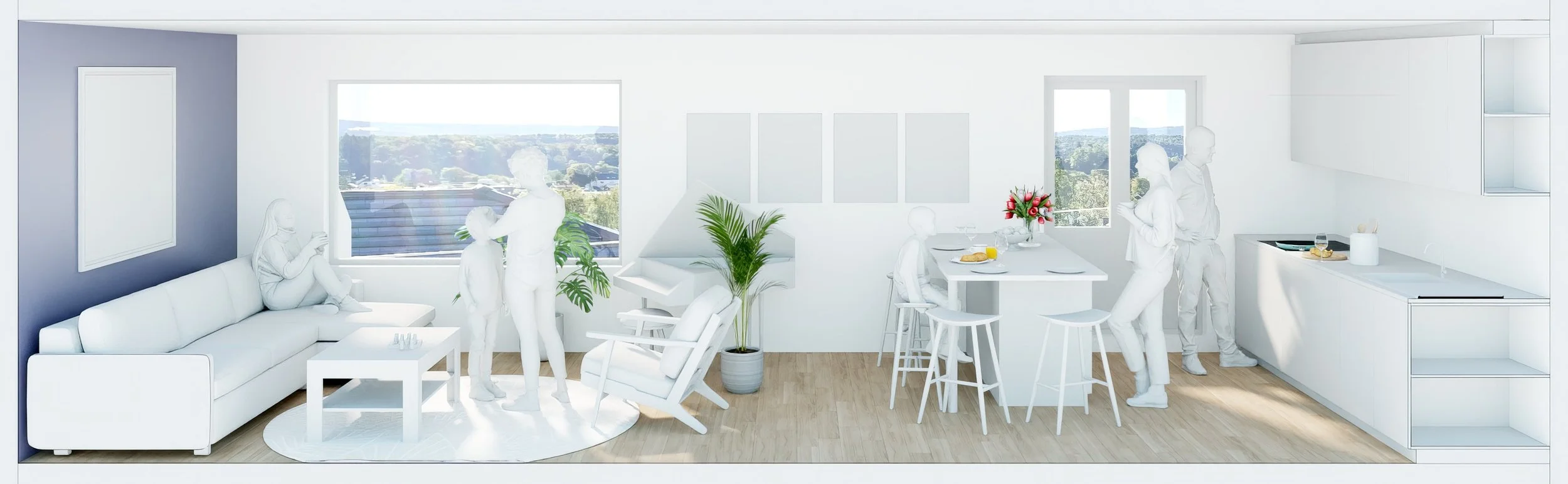
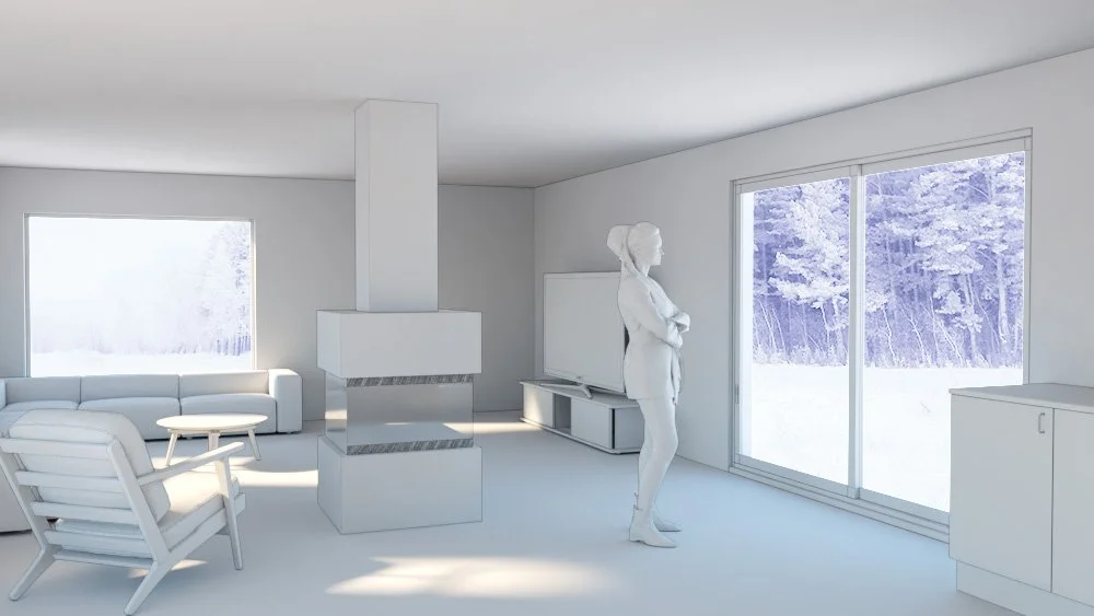
Our first step was to move bedrooms to the upper floor, so that we could gather all social spaces on the ground floor, just a step away from the garden. We then removed a few internal walls to open two long perspectives across the whole ground floor. This created a close connection to the garden, making it both visible and easily accessible from all living spaces.

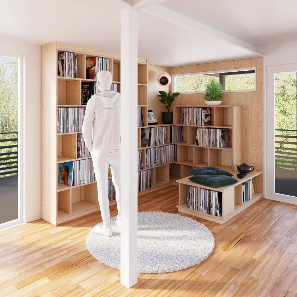
These spaces — where eating, relaxing and socialising take place — naturally organised themselves around these open lines, articulated by the existing staircase and a new wood stove. Each living space is designed with its own sense of scale and openness. Yet, it can be used as an extension of another, giving maximum flexibility both for everyday life and for the large social gatherings that our clients love to host.

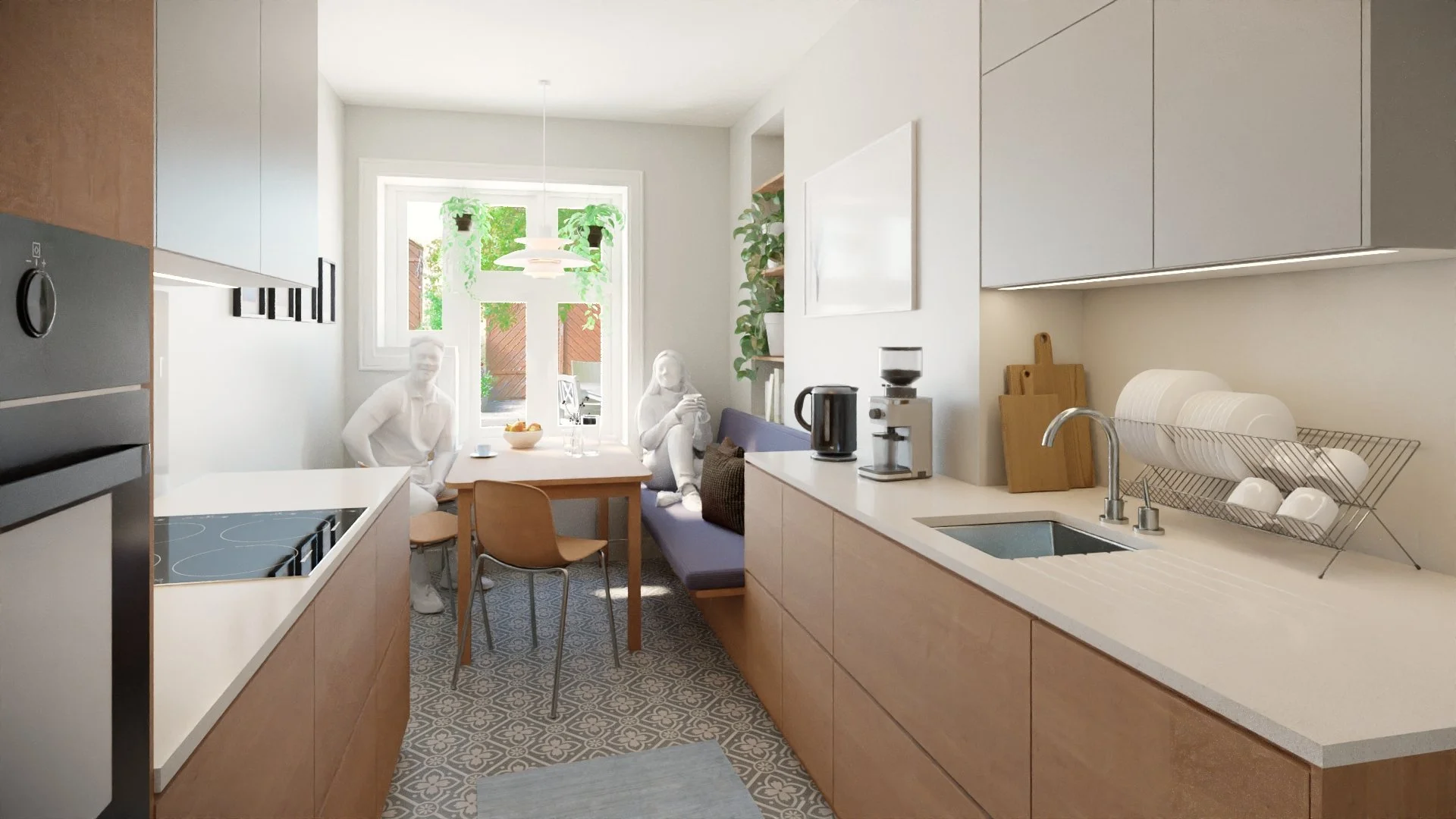
The kitchen — the natural heart of the house for the family — is now placed at the very centre of this plan and is connected to all surrounding social spaces. A screen of open shelving wraps around the kitchen, to subtly shelter it and discretely accommodate storage, appliances and a study (that doubles as an accessible guest bedroom) on the north-east.

Opening up to the garden

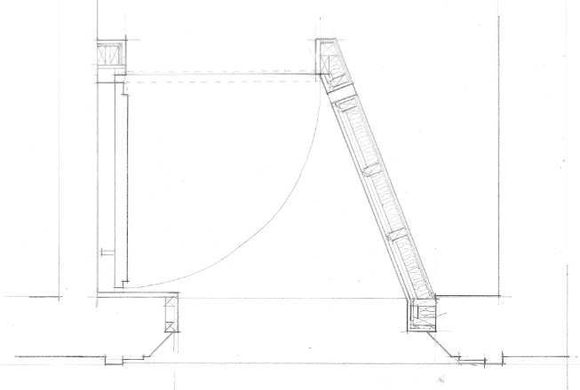
Each of the living-rooms extends to the garden through large French doors: on the south-east, onto a large timber terrace stepping down to the main garden, and on the south-west to a more private terrace that opens the dining room to the evening sun. Since all windows had to be replaced, we took this opportunity to redesign many of the openings to the garden, drawing daylight from different directions in all spaces and carefully framing attractive views to the outdoors.

To the south, we created a new functional and welcoming entrance to the house that also accommodates an accessible modern bathroom. Both this small extension and the new garage (relocated closer to the access road) are designed with similar flat roof details and horizontal cladding, contrasting with the taller existing house. Together, they frame an attractive new approach to the house that echoes the traditional "tun" of Norwegian farmyards, under the dappled shade of newly planted cherry trees.

An overview of the ground floor in relation to the garden (click for full size)

The remodelled basement, with its separate rental apartment

The private spaces

A new family bathroom and four bedrooms are located on the upper floor. One of these rooms doubles up as a separate TV/play room, where extra guests can stay overnight.

The basement is also remodelled: two thirds of it are transformed into a comfortable self contained apartment, which will be rented out to tenants before becoming an integral part of the house for family guests and teenager children. The large new windows bring plenty of daylight into the space and the separate access to the north and landscaping create a small private garden for the tenants. The remaining space in the basement accommodates a large washroom, as well as the technical installations and storage.

Comfort and sustainability

As part of the remodeling, we upgraded the whole house to meet current energy conservation standards, externally insulating the fabric of the building and replacing the existing windows with highly insulated ones.

We also made the most of the panoramic wood stove on the ground floor by coupling it with a modern balanced ventilation system: diffusing the stove heat in the whole house — including the four bedrooms upstairs— we could design the house so that most of the heating needs would be provided by renewable firewood, while also keeping optimal indoor air quality.


Portfolio project
A seaside cabin in Hvitsten

Thibaut Devulder

Sketch impression of the remodeled cabin, looking at the fjord from the playroom

We love to design cabins, as they bring together so many of our design interests.

First, our predilection for architecture in remote (and often sensitive) natural locations, to create small thresholds where man meets nature, where minimal environmental footprint and limited access call for an economy of means.

And we are fond of designing tiny spaces — creating places rich in human interactions and intricate functions where people can really "key in" with the architecture, bringing back the simple joy of being together, sheltered from the elements.

But as importantly, cabins also act as social nodes where the complex community of the different generations in a family or in a group of friends congregate, each with their different needs, expectations and desires, making for a challenging but fascinating briefing process.

This redesign of a seaside cabin in Hvitsten, on the shore of the Oslo fjord, brought all these aspects together and was a nice counterpoint to our earlier design of a skiing winter cabin in the mountains of Hedmark.

A small stream flowing between the existing cabins

About the project

As is often the case with Norwegian cabins, our clients for this project spanned over three generations. Initially built in the 1950s by the great-grandfather, the summer cabin and its small sleeping annex have been used ever since by the family for spring and summer holidays.

The extended families are now struggling to all fit in the cabins, which has become both too small and in need of repair. Now retired, the grandfather and his partner also want to use the cabin a lot more throughout the year, so they needed the uninsulated cabin to be upgraded for the winter climate and wished to have a real bathroom installed.

All had cherished childhood memories of the cabin and wanted to preserve as much of its exterior aspect and rustic character as possible. So, their requirement to comfortably fit in up to twelve sleeping guests for occasional extended family gatherings called for inventive remodelling and renovation, considering their tight budget!

Looking at the existing cabins

Perched against a steep rocky hillside overlooking the sea, the cabins face south-west into a breathtaking view of the Oslo fjord and its slow ballet of sailboats and cruise ships.

The Oslo fjord, as seen from the main cabin

Plans of the existing cabins

In the main cabin, the small living room actually had a large window opening towards the fjord, but the kitchen and meal area — central to family life in the cabin — were situated behind it, in the darkest part of space of cabin, right against the rock face to the north. The other facades of the cabin were essentially blind because of a small hallway and the two bedrooms to the west. As a result, the main daytime social spaces had no visual connection with either the covered porch to the south-west or the sleeping cabin to the west, both of them often used in the mornings and evenings for informal meals and drinks.

Typical of spaces with light coming from only one direction, this configuration made the living room and meal area appear strangely gloomy, as the large window created a glare effect in contrast with the other darker and unlit interior surfaces. Built to look straight onto the fjord through this large window, the space had only short interior perspectives, making it appear more cramped and small than it actually was.

Situated a few meters downhill and to the west, the sleeping annex had a quiet simplicity to it, nested in the overgrown vegetation and straddling a small stream in the rocks. Unfortunately, an improvised shower had been installed inside a few years back without proper ventilation and created damp problems, so that in addition to being overcrowded, its sleeping rooms had also become uncomfortable.

Welcoming everyone

The initial plan was to integrate the existing porch into the main cabin, to create an extra bedroom. While this made sense to accommodate more guests, we all agreed that this compounded some of the existing problems, in particular closing off the main cabin from the fjord.

From two to fourteen sleeping guests! (click for full size) 

Turning the problem around, we actually removed one bedroom from the main cabin, thus keeping only one for the most frequent occupants of the cabin: the grand-father and his partner.

We carefully checked the feasibility of our proposal by preparing a comprehensive list of use scenarios, from one couple to up to fourteen sleeping guests! We found that moving the shower out of the sleeping annex, ventilating it properly and making some slight adjustments to its interior layout and bedding would allow eight people to comfortably sleep there. All this could be done at minimum cost, so that most of the available budget could be dedicated to the main cabin.

Now remained the task of optimising the shared daytime spaces in the main cabin. And this was essential: every parent can imagine the intense atmosphere when up to three families, including young children, are stuck together indoors for a whole rainy afternoon! Thus, in addition to creating functional living quarters, we also needed to organise sub-spaces within this small cabin, so that everyone could define his or her comfortable own space.

A niche in the rocks

We approached this task from two different angles.

Our design strategy for the remodelling the main cabin, drawn over the plan of the existing cabin (click for full size).

First, we created two different sub-spaces: one for the adults, facing the fjord, more social and relaxing, and one more playful for the children, cradled against the vegetation of the shaded cliff face. These two spaces intersect around the dinner table, the natural converging point for the whole family.

Then, we connected these spaces to the outdoors by nesting these sub-spaces around generous openings — not just towards the fjord, but also towards the sleeping cabin wrapped in overgrown vegetation down to the west, the mossy rocks at the north and the sunbathed terrace to the south — to create a dual feeling of spaciousness and enclosure.

Sketch impression of the remodeled seaside cabin, looking across the living room

Although the main living space remains compact, it feels opened to the light patterns and textures of its natural surroundings.

Frequently eating out during the summer months, the kitchen and dining area extend out onto a terrace that is stepping down, so as to maintain unobstructed views of the sea horizon, even when terrace parasols are used or the large awning on the south facade is deployed. The terrace also acts as a connecting point between the main cabin, the play garden and the shaded path to the sleeping cabin.

The proposed plan for the main cabin (click for full size)

Fitting it all together

Space was very limited inside the main cabin, so we concentrated most of the storage along the west wall, designed as a large oak surface perforated by the kitchen and large window niche where children can sit and play. To make sure that everything fitting nicely, we produced a detailed specification for these densely fitted interior — both in Norwegian and in English, at the clients' request.

We love to involve our clients in the building process. And since one of them is keen on woodworking, we had a design session together to develop together the design of open screen between kitchen and sitting, which also will also integrate coat/shoe storage, seating, a book shelf and the TV equipment. He will later on build it himself.

The very basic existing drainage and electric systems were upgraded to cater for the new bathroom and appliances. The cladding was damaged and needed replacing, so we insulated the whole building fabric and fitted new energy-efficient windows. Along with a flexible shading system and ample provisions for natural ventilation, our clients will be able to enjoy their cabin all-year round!


Portfolio project
Squint: a micro-exhibition module

Thibaut Devulder

Mining some of our old files recently, we dug up this little gem from 2006: a mobile exhibition module we called Squint. It's an installation we originally designed for a competition in Calgary, for the temporary transformation of an urban space situated under a railway bridge.

Squint in the streets of Calgary (from our competition entry in 2006)

Excited by the idea of the self-building something we would then send to the other side of the world, we took the approach of a foldable crate system that could be deployed in an unlimited number of configurations, playfully modulating the openness — or enclosure — of the micro exhibition space it hosted.

Set on its site and then manipulated by the public, the articulated and perforated little structure offered glimpses of its content to passers-by, "leaking" some of its content to the surrounding urban space.

In another context: Nottingham's Exchange Arcade...

And of course, for easy transportation, the whole thing can be neatly folded into a tiny, self-contained crate containing both the panels and the exhibition materials, ready for shipping!

This was a fun little project and maybe something to prototype again?
Interested? Get in touch with us!

Weaving space: an exhibition of student design work

Tom Hughes

The Master level architecture studio project that 2hD's Tom and Alina ran at Nottingham Trent University this year has concluded with an exhibition in the University's Arkwright building.

The exibition was designed by Alina and featured a dress by fashion designer Kula Tsurdiu (the project client) alongside selected work from the architecture students.

exhibitionpanorama

Portfolio project
A skiing cabin on Sjusjøen

Thibaut Devulder

Entrance of the existing cabin

Planning permission has been granted to our project on the stunning settings of Sjusjøen, north of Lillehammer, Norway.

Overlooking the well-known Norwegian cross-country ski resort, this small mountain cabin, built in the late 1960s by the client's parents, had become too small for her extended family. The client wanted to remodel and extend it to accommodate family gatherings. With no running water in the kitchen and only two sleeping spaces, the cabin also lacked sufficient indoor storage to accommodate more than two guests.

Emotionally attached to the cabin, the client wanted our intervention to address these issues, yet preserve the modest scale of the building, as well as most of its interior and exterior finishes and furniture — some of them hand-made by her father.

We tackled the challenge by extending the cabin towards the west. Shifting the entrance to the other side of the cabin greatly simplified winter access, avoiding snow drifts from the roof and reaching out closer to the car parking space. More importantly, this allowed us to create a central spine running through the extension.

Linking together the extension and the existing cabin, this spine accommodates extensive storage spaces serving the master and guest bedrooms, where luggage can be droppped on arrival without cluttering the living rooms.

Clad in timber slats, contrasting with the other materials of the cabin, the spine acts a functional and visual link between old and new, sheltering the sleeping quarters from the common spaces.

At the end of the spine, minimal reorganisation of internal partitions allowed for a compact and comfortable kitchen and bathroom, with minimum alterations to the existing plumbing.

The wind lobby and storage were moved from the original access to the new entrance, with the addition of a ski preparation room. In their place, a new living room was modelled into the existing building fabric — opening up the cabin to the fantastic views to the wild marsh on the east and the sun's warmth to the south.

Externally, the extension matches the scale and appearance of the existing cabin. The two bodies however are connected by a section with a lower roof and cladding matching the sheltering slats of the existing entrance, clearly identifying the new from the old.

Inside, most of the floor and wall finishes of the existing wing are preserved. The new spaces, to the west and south, however, contrast with their sloped ceiling and stained boarding.


Portfolio project
Self-build house on a Norwegian hillside

Thibaut Devulder

The single-family house we designed on a hillside of Eidsvoll, in Norway, is now under construction by our self-builder client. Created as two wings intersecting with the landscape, the design reconciled our clients' wishes for both discrete privacy and openness to the surrounding woodlands.

Sketch impression of the house with its two intersecting wings, from which the terraces cascade into the forest

Moving out of their current undersized house in the same town, the family wanted to settle on one of the plots owned by the family (we helped the client masterplan this area back in 2011). The plot is situated on an ideally oriented hillside with woodlands at its doorstep and great views to the surrounding countryside.

We designed the family house to clearly separate public spaces receiving visitors (including a small home office) and the more private parts of the house. These two realms are organised in separate wings, articulated by two intersecting gables. At this intersection, an open atrium links the two levels and a sheltered outdoor porch opens up towards the adjacent woodlands to the south-west, stepping down into the landscape through a series of cascading terraces.

Interior view of the atrium, at the intersection of the two wings (Photo @ Caroline Prøven Brohaug)

The external form of the house also responded to the height restrictions of the local planning rules and the steep site slope. Despite the site steepness, the house benefits from a full wheelchair access to all key functions of the home.

Privacy from the existing neighbouring apartment building (also owned by the client) was preserved by vertical timber fins along the facade, framing the views and giving a common vocabulary to the different elevations.

Foundation and groundworks are almost completed and the timber superstructure (insulated with natural cellulose fibres) will be completed before the first snow, at the end of November.


Weaving space: student exhibition

Tom Hughes

Alina and I are leading the Vertical Studio module this year at Nottingham Trent University, as part of the MArch (Masters in Architecture) course. It's a 10 week design studio delivered to both cohorts of the MArch course, aimed at bringing in practitioners with a particular set of approaches, whilst introducing new students to NTU and preparing final year students for their major dissertation projects.

We've decided to build the studio around the notion of weaving — both as an approach to understanding one way of making structure and space and as an analogy for the multi-stranded assemblage of information, knowledge and ideas that go into an architectural design project.

The site we've chosen is what we've termed an 'urban appendix' — a former thoroughfare truncated by the building of Victoria Station in Nottingham, and then overshadowed by its replacement, the Victoria Centre. This unloved backwater will be stiched back into the urban fabric by housing a dressmaker's shop, design studio and workshop.

During the first week the students were set the ambitious target of putting on an exhibition of exploratory models. Following visits to Kula Tsurdiu (acting as client) and the NTU textiles exhibition and weaving workshops, the students investigated techniques of stitching, pleating, weaving and fusing to create their models. It was great to see a lot of careful investigation and reckless experimentation coming together in a short space of time — the students really responded to the challenge and we look forward to seeing their designs develop over the coming weeks.

Walker House remodel

Thibaut Devulder

The existing house

Our clients are now finalising the site work on our remodel of their home in Eidsvoll, Norway.

We were originally approached by the clients in 2011, to reorganise a family house that had become overcrowded for their family of five and — more importantly — to create a modern comfortable home they would be proud of.

The clients' brief

The model of the surveyed house

Already extended once, this house was in fact spacious enough for the family. Yet the existing layout made poor use of the internal space: stiffly compartmenting into disconnected rooms, the floor plans created several "dead areas" on key locations of the three levels, which were mostly left unused by its inoccupants or barely used for storage.

The existing services were obsolete and poorly placed — with no bathroom on the ground floor for instance — and the clients were eager to upgrade the building fabric and technical installations as part of the remodelling exercise. Summer overheating and noise from the increasing overhead airport traffic were particularly problematic.

Conscious that their three teenage sons would soon be leaving the family home, the parents were also willing to remodel the house so that the upper floor could easily be isolated from their accessible quarters on the ground floor in the coming years, to be rented out to tenants with minimum additional work.

All these had to be addressed with minimum alterations to the exterior of the building, to fit the budget and the local planning rules.

Unlocking the flow

After a detailed survey of the existing house, we identified key factors breaking the flow through the house. These were tackled by a series of strategic moves that could unlock the potential of the space in a cost effective way. At the core of the approach was to clarify the organisation of public and private spaces, and how these flowed into one another.

A few key changes to the internal building fabric allowed us to both connect the spaces for greater flexibility in use (to host large family events, for instance) and respond to the need for privacy between the different parts of the house.

 Creating an experience

Altering the floor plans was the first move to transform this home. We extended this approach to carefully select interior materials and light fittings, to suggest and emphasize the new relationships between the spaces.

Entering the house, the visitor is drawn further into the spaces by a series of focal points revealing themselves progressively from different viewpoints as the house is explored, linking the social spaces and the large garden outdoors.

Improving comfort

The timber structure was fully re-insulated internally, using high density natural wood fibre insulation to improve all year round thermal comfort and dampen external noise. Comfort was further improved by replacing the existing windows with hi-spec new low-energy and noise reduction glazing.

With minimal changes to the existing drainage system, two new family bathrooms and a guest toilet were added to the ground and first floors. Connected to a new centralised ventilation system, they dramatically improve indoor air quality in a quiet and energy efficient way.

Working in close collaboration with the clients, with their in-depth knowledge of every corner of the house and the way it was constructed, allowed very detailed design and planning of all the alterations, while keeping building costs low.

Low energy house, high quality space

Tom Hughes

Over the bank holiday I dropped in to see how the clients for our low energy house are getting on. They've been in residence for a good few months now and it was great to see the house in operation as a home.

The property is going to be open to visitors as part of the programme of tours arranged during September 2013 by West Bridgford Eco Houses- if you want to visit check out their blog post about the house.

All the energy saving features are behaving well, although it is too early yet to get statistical feedback on performance. The basic principle is to make good use of passive solar gains from the south and trap the heat in the the high thermal mass of the building, inside a highly insulated jacket. Overheating is prevented by the thermal mass, which evens out temperature highs and lows, and by effective use of shading on the south facing windows. The other important factor is to control drafts, and the build quality here is exceptionally good.

The really gratifying thing to see was that the house is working well as a home for our clients- it's clearly a comfortable, welcoming and relaxed place to live.

Storgata interiors

Thibaut Devulder

As part of their remodelling and refurbishment of a large office building in downtown Oslo into the new Olympiagården project, Various Architects — with whom we are sharing an office — invited us to work with them on the detailed design of interior furniture for their design of the future Lederne Headquarters.

Concept development for stacked wood partitions

Various Architects' design included a series of large timber partitions that would integrate seating, services and storage. Articulating the new refurbished office space in a playful and subtle manner, these interior elements were to create a unifying visual and functional concept for the large open plan office.

Their design and positioning were to weave social spaces to create spots for impromptu social interactions, but also help subtly define more private areas for focused work and conceal the services and air conditionning system. Other furniture such as the reception desk and work spaces, were also to be custom-made in a similar fashion.

Image © Various Architects

Image © Various Architects

Based on their brief we developed a series of design concepts playing on the idea of the massiveness of stacked timber elements, with their textures contrasting with the existing concrete structure of the building. These concepts were developed with Various Architects, in consultation with a number of joinery companies specialised in custom-made office fittings, that gave us feedback during the design stage, to make sure that budget and technical constraints would be met.

We then finalised the detailed design of the timber elements and prepared a series of concept and technical drawings that were incorporated to the tender package for the project.

The refurbishment and fittings of the Lederne Headquarters is now on site. As with our collaboration on the Aalto Campus competition, it has been a pleasure working with Various Architects and we are looking forward to collaborating with them again on exciting projects!

New light filled heart to a 1920s home

Tom Hughes

Our strategic approach to the remodel of a 1920s home was to carve out a new space at the centre- relinking areas of the house that for reasons of class had originally been divided into servant and served.

Into this void would go a contemporary stair, a strong element in its own right but designed to direct space- creating important spatial links and sightlines.

The existing stained-glass steel framed window to the south elevation remains in place, pouring light into the new heart of the house.

Lost Cuckoo workshop at NTU

Thibaut Devulder

Furthering our exploration and experiments using the cardboard module developed for the Lost Cuckoo project, Marcus Rowlands and 2hD Architects ran two "lectures" at Nottingham Trent University.

Images by Marcus Rowlands and Matthew Mouncey

With the participation of staff and students from the School of Architecture, Design and the Built Environment, and in a lecture hall setting. This was, however, not your standard lecture format: the starting point was for each person to build a module, then to team up and build an assembly, and finally to bring everything together to create a space-within-a-space... in which the 'lecture' would happen.

March 2012. Workshop run by Marcus Rowlands and 2hD Architects using the cardboard construction module developed for the Lost Cuckoo project. With first year Interior Architecture student, at Nottingham Trent University's School of Architecture, Design and the Built Environment. Marcus Rowlands: http://marcusrowlands.com 2hD Architects: http://2hd.co.uk

Video by 2hD

A living-room in a children's home

Tom Hughes

The proof of the pudding, as they say, is in the making. I spent Sunday volunteering at the site of our Childrens' Home project, helping them to get the building phase of their Living Room project underway.

The shared living room, before we started

It's been a fascinating project to be involved in. We were approached by The Mighty Creatives who were looking for someone who could work with the staff and residents at the Home to redesign their living room, making use of IT to communicate and visualise the process. In the end, we used StickyWorld and SketchUp with the LightUp plug-in… and if we could have found another software with a JoinedUp name, we'd have considered that too.

It's a tiny but intense project, and I found the design process really challenging. Working on occupied houses is always pretty involved, as being invited into the home requires a great deal of sensitivity to residents' preferences and relationships. At the same time, your own knowledge and experience as 'the professional' needs to be given a voice. As you'd imagine this particular living space is charged with a lot of meaning for many different people... But, by working together, we gradually achieved a design that everyone could take pride in.

The idea is that as much of the making work as possible is done by the staff and residents of the home, but I invited myself along on Sunday to lend a hand as they got underway. The electrian had already been in to do the first fix, so the next stage was setting out the studwork for the 'portal' feature, the lighting raft and the storage/entertainment wall. We made pretty good progress- a bit slowed by the effort of breaking up the world's densest fireplace hearth, but by the end of the day the design was beginning to pop off the page and in to the space. I loved being there to see this happen and hope to be back again as the project progresses.

In the meantime, we made a little film to celebrate the success of the collaborative design, and keep spirits up during the hard messy work ahead:

Living Room Project from 2hD Architecture Workshop on Vimeo.