Design concept for a fire station

Thibaut Devulder

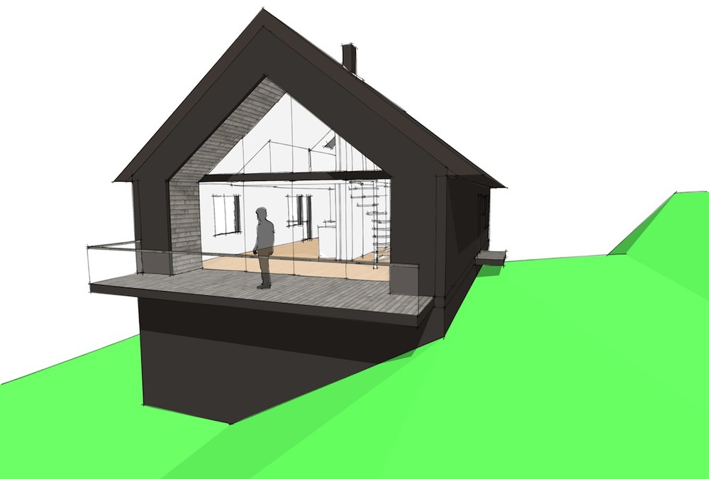
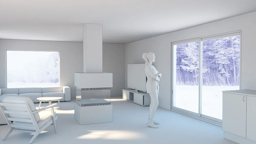
Concept design visualisation of our future fire station in Såner, Norway, with its public facing core building and connected modular fire engine halls at the back.

I have been collaborating this last week with Besseggen Arkitekter (with whom we are sharing our new office in Oslo), developing a design strategy for a new fire station in Vestby, Norway.

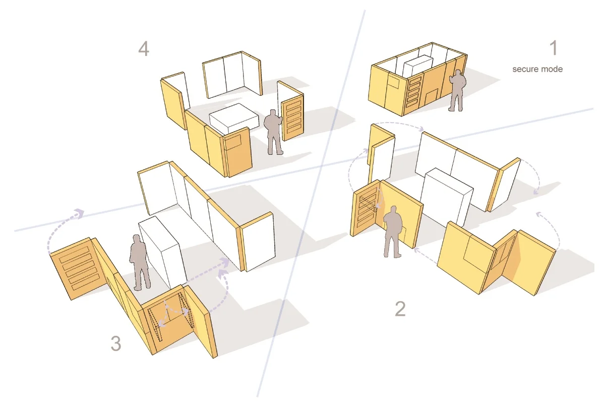
The competition brief called for an easily extendable building, with a strong focus on personnel safety. I have prepared this sketch concept view, together with diagrams explaining our design approach to address these points. Using a construction strategy based on modular plug-in elements with identical folded structure roofs, each module can be easily connected to the station as it expands in the future, supplementing both additional capabilities and associated staff accommodation to the facilities.

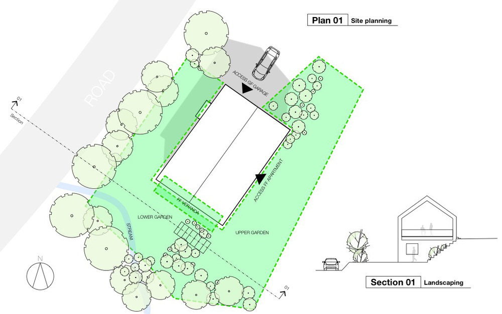
The design strategy diagrams we prepared for the competition
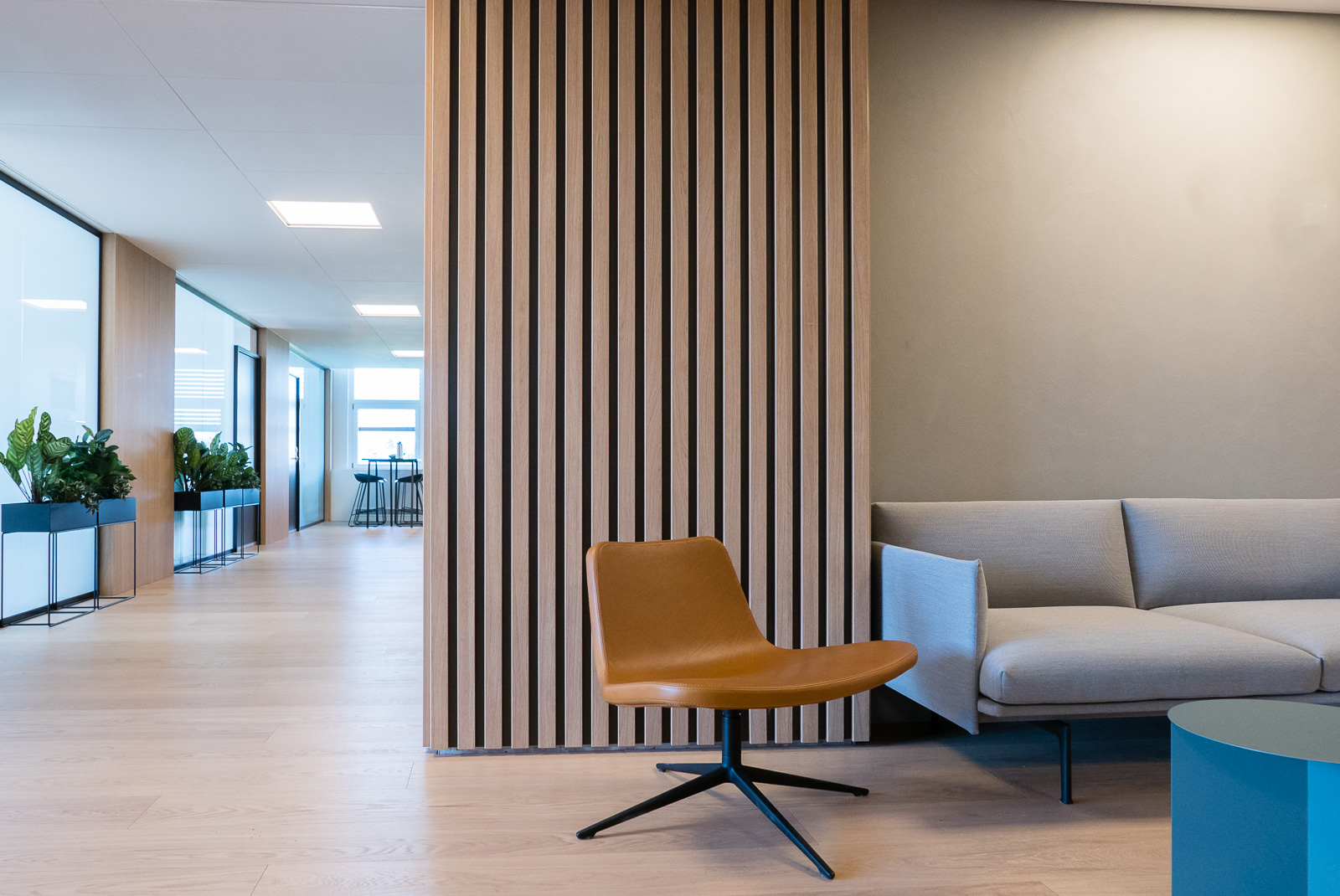
Photography: Colosseum Mann hospital, by Montaag

Thibaut Devulder

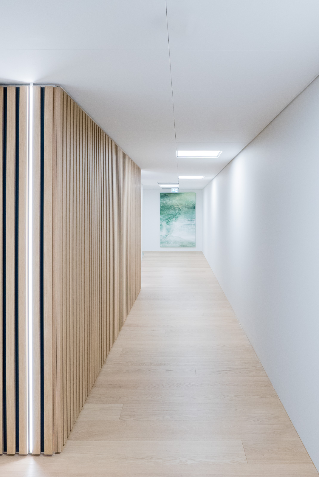
Some images from my photoshoot of the Colosseum Mann hospital, in Oslo, recently redesigned by the very talented team at Montaag, a multidisciplinary design studio based in Norway and California.

P8530150.jpg

Photography: Nordisk Film & TV Fond

Thibaut Devulder

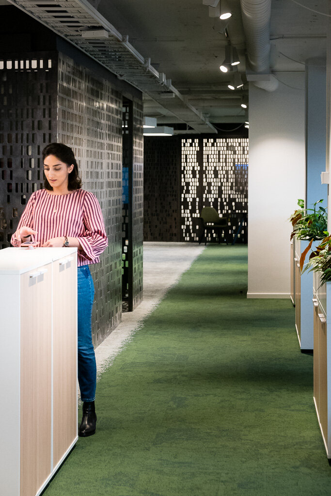
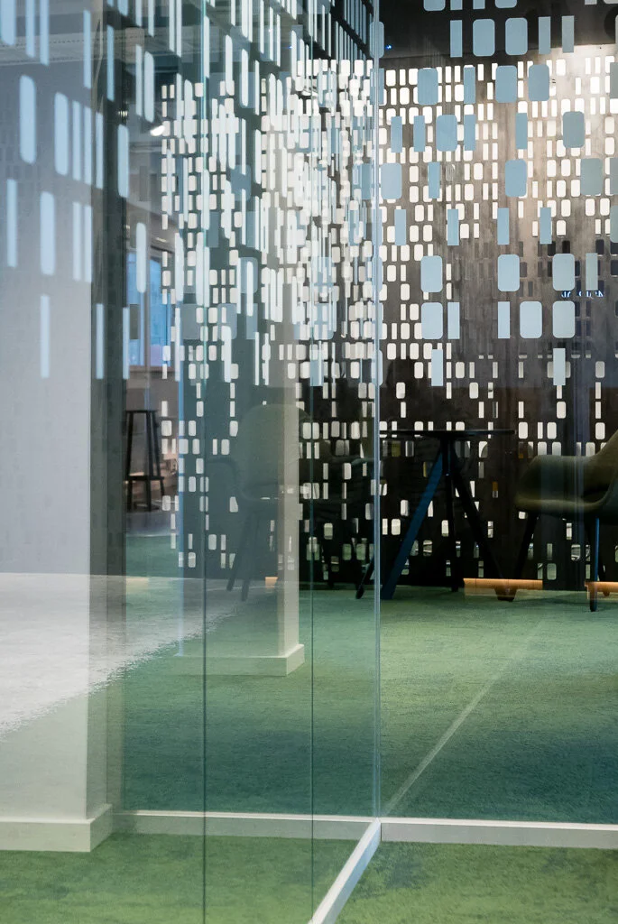
Some images from my photoshoot of the office interior at the Nordic Film & TV Fond in Oslo, freshly redesigned by Kubik Interiørarkitekter.

Photoshoot: Holbergsgate 21

Thibaut Devulder

Some images from my photo session at Kubik’s latest interior design for Oculus, in Oslo.

Photography: Akersbakken 12

Thibaut Devulder

A photoshoot of Kubik's latest interior design, on Oslo's riverside. 

Photography: Kubik's Nedre slottsgata

Thibaut Devulder

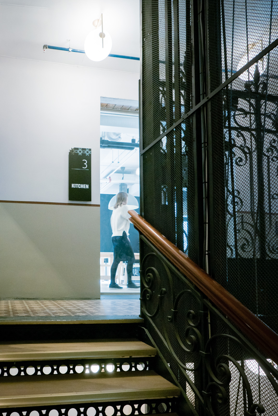
A new photoshoot forKubik Interiør Arkitekter: a newly redesigned staircase in Oslo's city centre.

Photography: UGG showroom

Thibaut Devulder

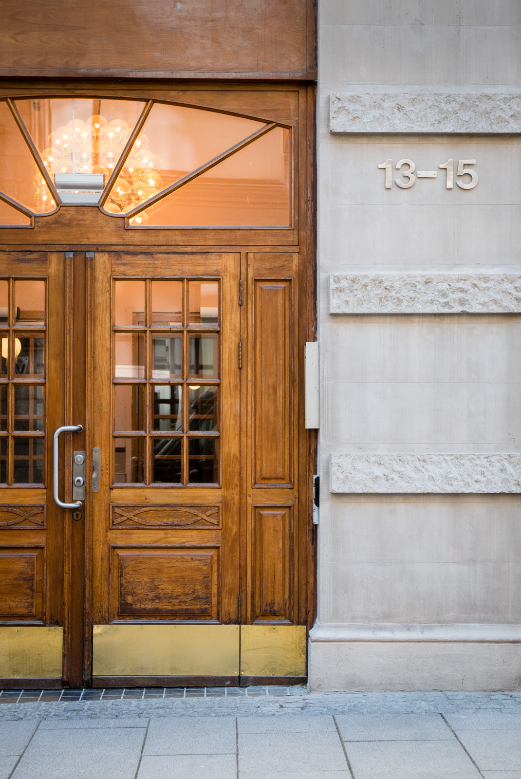
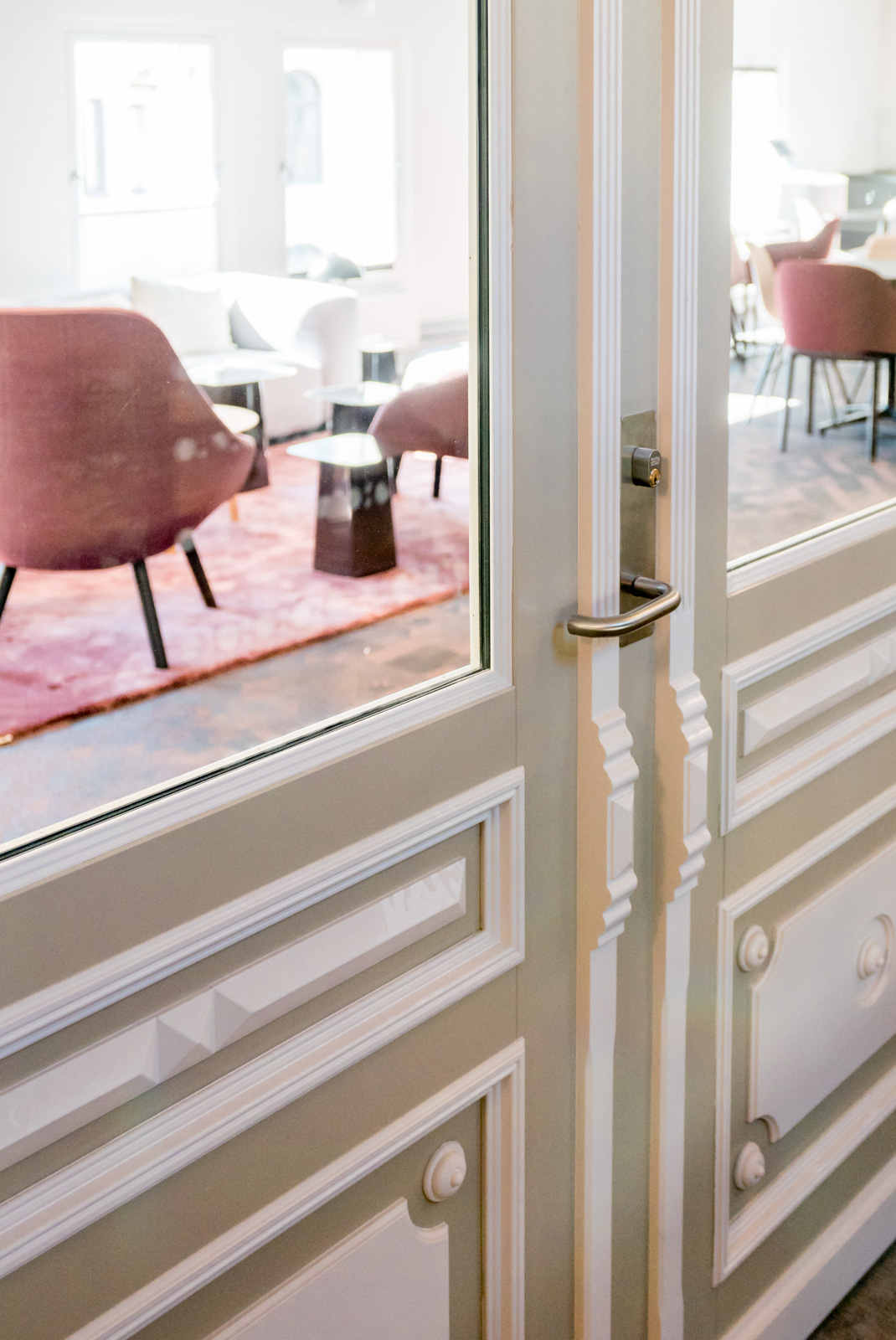
I have just completed another photoshoot with interior architects Kubik, this time to photograph their recent refurnishing of a showroom for the uber-trendy shoe designer UGG, in Oslo.

Creating a flexible outdoor social space

Thibaut Devulder

For this small project, we were approached by clients who wanted a sheltered space to host their frequent outdoor social events. We helped them design an integrated and flexible garden structure, to create a comfortable outdoor microclimate, whatever the weather or the occasion.

Our client, enjoying a late summer evening in the transformed terrace

The house already had a well-exposed adjacent terrace, but the the westerly wind and rain showers often disturbed the frequent social gatherings organised by our clients. They were looking for an affordable solution that would provide them with flexible configurations for the various social occasions (from small family dinner to large work events with 20+ guests).

Analysing each use scenario, we focused on creating a solution that would integrate well with the existing hard and soft landscaping, yet remain flexible in its use and the degrees of shelter it could provide.

In particular, we wanted to keep the space as open as possible to its surrounding. So we opted for a system of retractable textile roofs and glass screen walls, so that the outdoor space could function well throughout the year, whatever the weather, the number of guests and the type of activity it would host.

In parallel to this design process, we investigated both custom-made and standardised garden structures. We eventually converged towards a hybrid option, whereby we customised an existing pergola system to tailor it to the specific needs and taste of our clients and to the site, keeping the project on budget and allowing for fast-track installation — on time for the Norwegian National Day!

Testing furnishing configurations and checking their feasibility using standardised and custom-made elements, we refined the design with the clients to converge towards the final built result.

Our clients have since then sent us some nice photos, having enjoyed their new outdoor space from early spring to late autumn, hosting many social gatherings with family and friends!

Squint: a micro-exhibition module

Thibaut Devulder

Mining some of our old files recently, we dug up this little gem from 2006: a mobile exhibition module we called Squint. It's an installation we originally designed for a competition in Calgary, for the temporary transformation of an urban space situated under a railway bridge.

Squint in the streets of Calgary (from our competition entry in 2006)

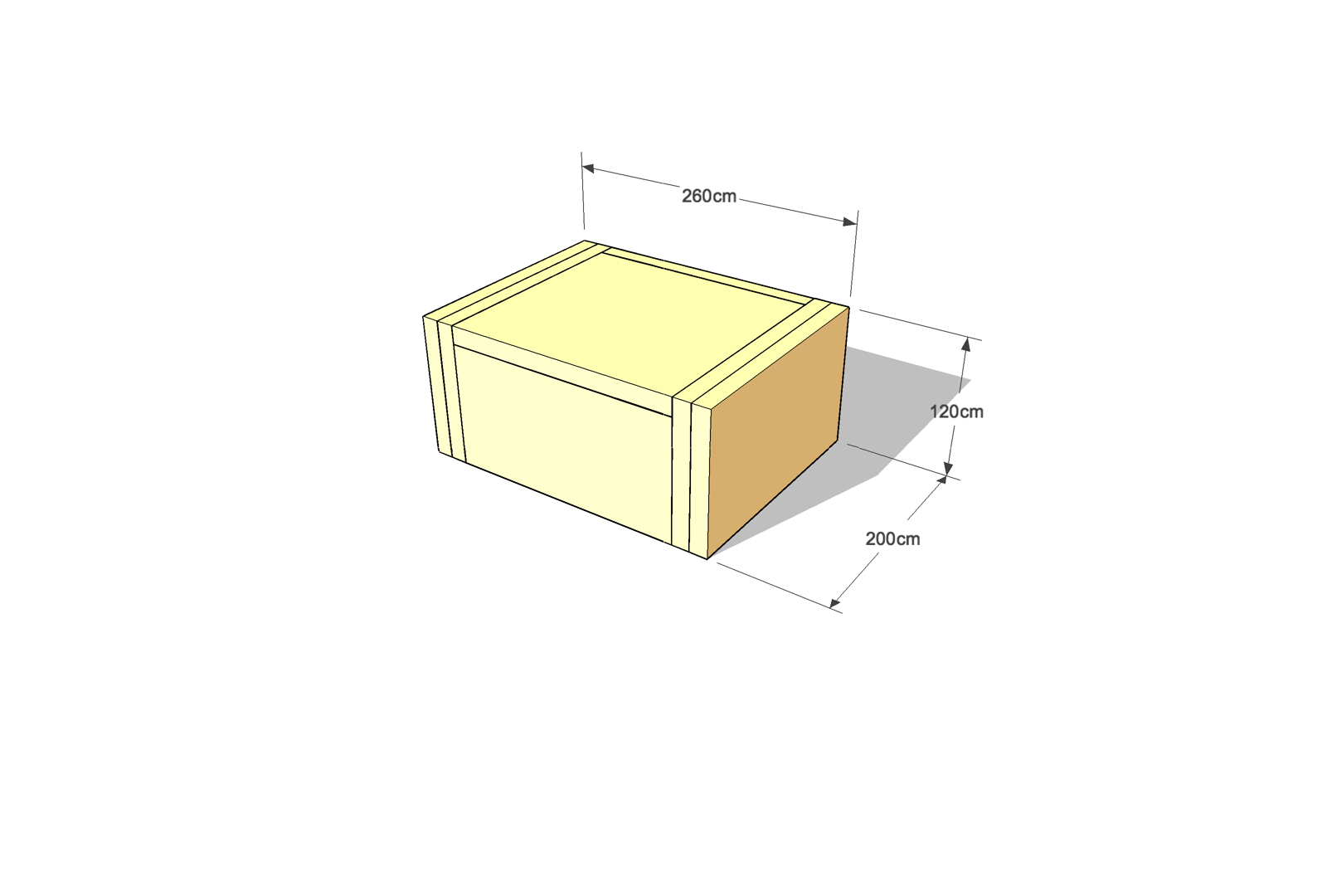
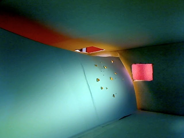
Excited by the idea of the self-building something we would then send to the other side of the world, we took the approach of a foldable crate system that could be deployed in an unlimited number of configurations, playfully modulating the openness — or enclosure — of the micro exhibition space it hosted.

Set on its site and then manipulated by the public, the articulated and perforated little structure offered glimpses of its content to passers-by, "leaking" some of its content to the surrounding urban space.

In another context: Nottingham's Exchange Arcade...

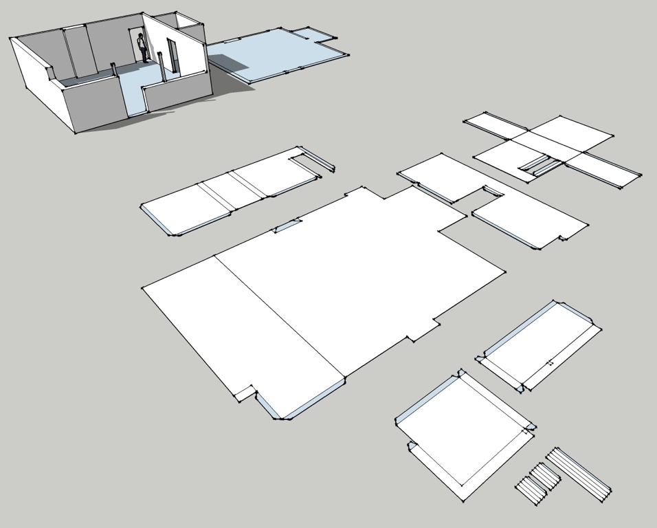
And of course, for easy transportation, the whole thing can be neatly folded into a tiny, self-contained crate containing both the panels and the exhibition materials, ready for shipping!

This was a fun little project and maybe something to prototype again?
Interested? Get in touch with us!

Self-build house on a Norwegian hillside

Thibaut Devulder

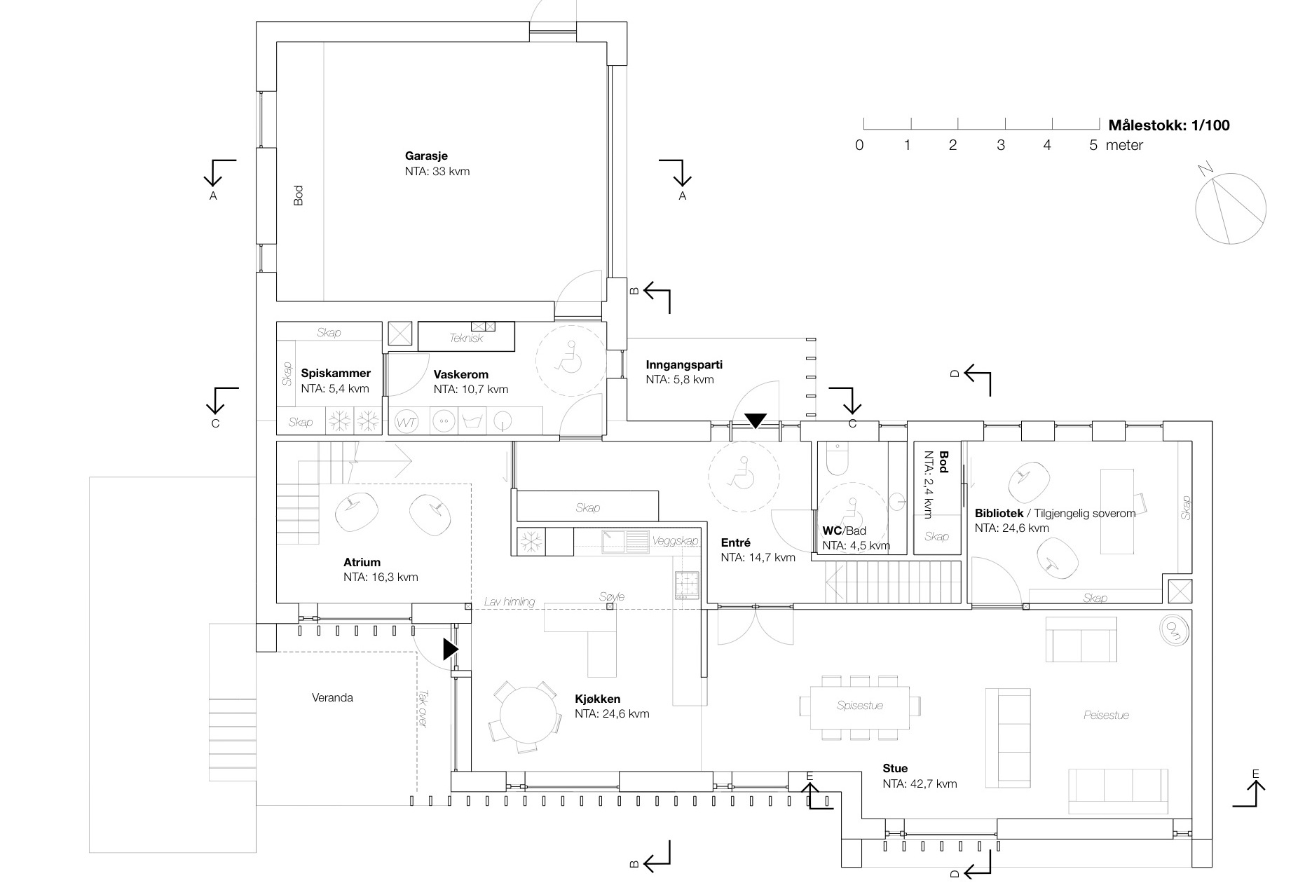
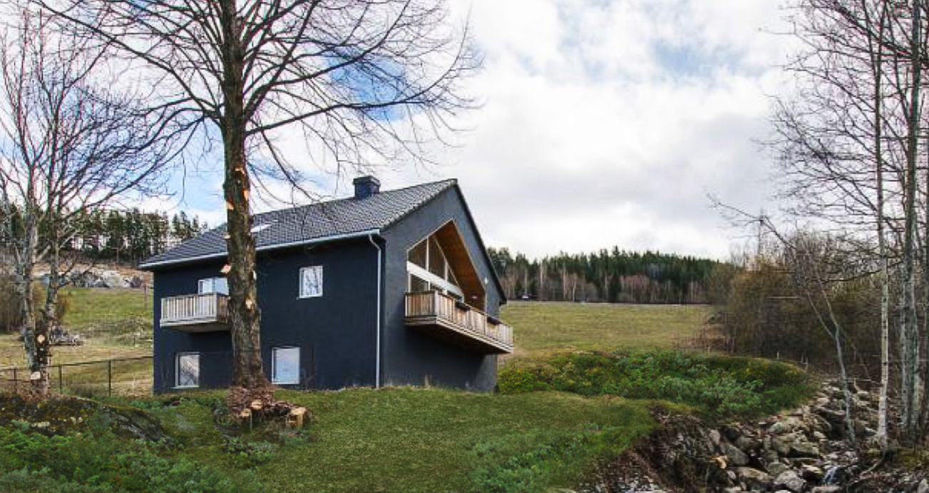
The single-family house we designed on a hillside of Eidsvoll, in Norway, is now under construction by our self-builder client. Created as two wings intersecting with the landscape, the design reconciled our clients' wishes for both discrete privacy and openness to the surrounding woodlands.

Sketch impression of the house with its two intersecting wings, from which the terraces cascade into the forest

Moving out of their current undersized house in the same town, the family wanted to settle on one of the plots owned by the family (we helped the client masterplan this area back in 2011). The plot is situated on an ideally oriented hillside with woodlands at its doorstep and great views to the surrounding countryside.

We designed the family house to clearly separate public spaces receiving visitors (including a small home office) and the more private parts of the house. These two realms are organised in separate wings, articulated by two intersecting gables. At this intersection, an open atrium links the two levels and a sheltered outdoor porch opens up towards the adjacent woodlands to the south-west, stepping down into the landscape through a series of cascading terraces.

Interior view of the atrium, at the intersection of the two wings (Photo @ Caroline Prøven Brohaug)

The external form of the house also responded to the height restrictions of the local planning rules and the steep site slope. Despite the site steepness, the house benefits from a full wheelchair access to all key functions of the home.

Privacy from the existing neighbouring apartment building (also owned by the client) was preserved by vertical timber fins along the facade, framing the views and giving a common vocabulary to the different elevations.

Foundation and groundworks are almost completed and the timber superstructure (insulated with natural cellulose fibres) will be completed before the first snow, at the end of November.


Porch that turns a house around

Tom Hughes

We've been working on the remodelling and extension of a Suffolk cottage for some time now — starting with our 2009 RIBA award winning artist's studio. An internal reworking of the ground floor has improved circulation, usable space and natural lighting.

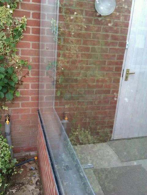
The final element is now on site: a glass and steel porch at the back door will create a generous welcome space and energy-saving draft lobby.

We often find with existing houses that the 'back door' is in fact the main access for family, guests and deliveries alike, and a decision has to be made: reinstate the status of the front door, or accept the established usage and make the back door a decent point of arrival?

In this case the 1980s flat roofed 'garden room' extension to the rear of the house - with improved windows and insulation - has become the main area for entertaining guests; the new porch will turn the house around and connect it all back together.

Walker House remodel

Thibaut Devulder

The existing house

Our clients are now finalising the site work on our remodel of their home in Eidsvoll, Norway.

We were originally approached by the clients in 2011, to reorganise a family house that had become overcrowded for their family of five and — more importantly — to create a modern comfortable home they would be proud of.

The clients' brief

The model of the surveyed house

Already extended once, this house was in fact spacious enough for the family. Yet the existing layout made poor use of the internal space: stiffly compartmenting into disconnected rooms, the floor plans created several "dead areas" on key locations of the three levels, which were mostly left unused by its inoccupants or barely used for storage.

The existing services were obsolete and poorly placed — with no bathroom on the ground floor for instance — and the clients were eager to upgrade the building fabric and technical installations as part of the remodelling exercise. Summer overheating and noise from the increasing overhead airport traffic were particularly problematic.

Conscious that their three teenage sons would soon be leaving the family home, the parents were also willing to remodel the house so that the upper floor could easily be isolated from their accessible quarters on the ground floor in the coming years, to be rented out to tenants with minimum additional work.

All these had to be addressed with minimum alterations to the exterior of the building, to fit the budget and the local planning rules.

Unlocking the flow

After a detailed survey of the existing house, we identified key factors breaking the flow through the house. These were tackled by a series of strategic moves that could unlock the potential of the space in a cost effective way. At the core of the approach was to clarify the organisation of public and private spaces, and how these flowed into one another.

A few key changes to the internal building fabric allowed us to both connect the spaces for greater flexibility in use (to host large family events, for instance) and respond to the need for privacy between the different parts of the house.

 Creating an experience

Altering the floor plans was the first move to transform this home. We extended this approach to carefully select interior materials and light fittings, to suggest and emphasize the new relationships between the spaces.

Entering the house, the visitor is drawn further into the spaces by a series of focal points revealing themselves progressively from different viewpoints as the house is explored, linking the social spaces and the large garden outdoors.

Improving comfort

The timber structure was fully re-insulated internally, using high density natural wood fibre insulation to improve all year round thermal comfort and dampen external noise. Comfort was further improved by replacing the existing windows with hi-spec new low-energy and noise reduction glazing.

With minimal changes to the existing drainage system, two new family bathrooms and a guest toilet were added to the ground and first floors. Connected to a new centralised ventilation system, they dramatically improve indoor air quality in a quiet and energy efficient way.

Working in close collaboration with the clients, with their in-depth knowledge of every corner of the house and the way it was constructed, allowed very detailed design and planning of all the alterations, while keeping building costs low.

Storgata interiors

Thibaut Devulder

As part of their remodelling and refurbishment of a large office building in downtown Oslo into the new Olympiagården project, Various Architects — with whom we are sharing an office — invited us to work with them on the detailed design of interior furniture for their design of the future Lederne Headquarters.

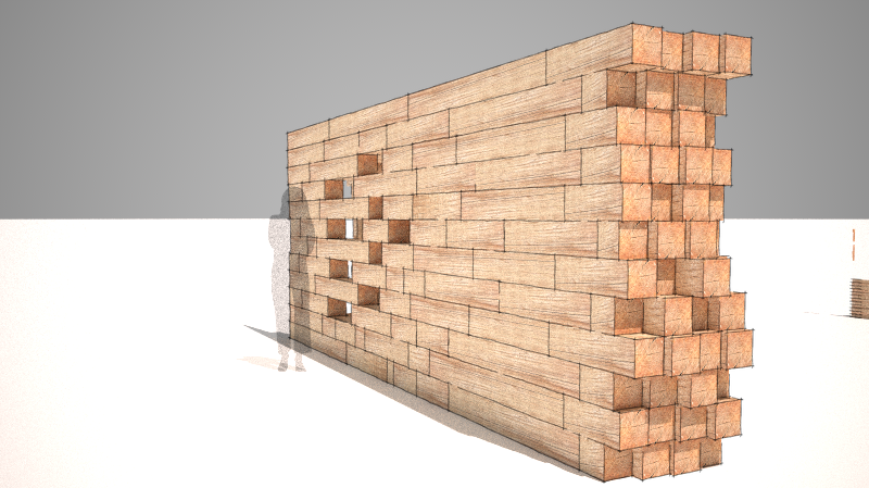
Concept development for stacked wood partitions

Various Architects' design included a series of large timber partitions that would integrate seating, services and storage. Articulating the new refurbished office space in a playful and subtle manner, these interior elements were to create a unifying visual and functional concept for the large open plan office.

Their design and positioning were to weave social spaces to create spots for impromptu social interactions, but also help subtly define more private areas for focused work and conceal the services and air conditionning system. Other furniture such as the reception desk and work spaces, were also to be custom-made in a similar fashion.

Image © Various Architects

Image © Various Architects

Based on their brief we developed a series of design concepts playing on the idea of the massiveness of stacked timber elements, with their textures contrasting with the existing concrete structure of the building. These concepts were developed with Various Architects, in consultation with a number of joinery companies specialised in custom-made office fittings, that gave us feedback during the design stage, to make sure that budget and technical constraints would be met.

We then finalised the detailed design of the timber elements and prepared a series of concept and technical drawings that were incorporated to the tender package for the project.

The refurbishment and fittings of the Lederne Headquarters is now on site. As with our collaboration on the Aalto Campus competition, it has been a pleasure working with Various Architects and we are looking forward to collaborating with them again on exciting projects!

Prag uthus

Thibaut Devulder

The original brief for this project was to create an outbuilding to an existing family house designed by renowned Norwegian functionalist architect Rolf Prag. This outbuilding would accommodate garage space and a small apartment for rental.

We designed a simple single-story building that echoed the typology of the main building, but keeping it visually more compact to respect the functional hierarchy between the main building and its servant outbuilding.

However, a year after the outbuilding was completed, the client decided to sell the main house and suggested moving to this outbuilding. Originally proposed as a joke by the client, this rapidly became an attractive option to temporarily accommodate the family, whilst their new house was being designed and built. The move, however, required a partial remodelling to accommodate a family of four...

The outbuilding then went into another iteration of design, the plot being subdivided to allow the sale of the main building. The area was also relandscaped to cater for this new use.

We merged the existing garage and storage space into the living quarters, creating two more bedrooms and a utility room. With minimal changes to the external appearance of the building, a new garden space and carport were fitted onto the tight plot, framing the entrance to the house and providing a low maintenance outdoor play space.

Planning permission has been granted and the remodelling of the outbuilding and hard landscaping work are now underway.

Tune house

Thibaut Devulder

We converted a derelict building on the bank of Mjøsa, Norway's largest lake, into an artist home with a large integrated workshop.

Reusing the concrete structure — an usual asset in Norwegian housing! — we created a focused work space, linked to a open plan apartment that takes in the beautiful views to the lake and its surrounding hillsides.


Stranded: extreme picknicking in the dunes

Tom Hughes

In response to the Structures on the Edge competition, we collaborated with artist Tristan Hessing, of One Thoresby Street, to explore the ambivalent relationship between art and nature conservation. We designed a shifting public art installation on the wild beaches of the Lincolnshire coast, on the theme of extreme picnicking.

The Stranded art installation, slowly eroding within the shifting sand dunes of the Lincolnshire coast

Our chosen site: a fragile dune ecosystem, isolated on a windblown seashore.

Stranded was our shortlisted entry for the 2010 Structures on the Edge art programme, and a distant cousin of our Bathing Beauties competition entry.
The artists’ brief called for small permanent structures in the sand dunes of the Lincolnshire coast that would respond to the wild beauty and harsh environment. Our response was to design an installation for extreme picnicking as a robust response to the rugged nature of the site.

Shifting sands

We decided to make our intervention at a dune crossing point, reinforcing and protecting the dune whilst giving views and shelter for visitors as they move between land and beach. Stranded would be a faceted concrete structure whose shape was derived from the dune surface, but with points raised to provide views and shelter, and others buried beneath the surface to provide foundations. We would see it as a geometric abstraction of the dune landscape, a frozen snapshot of the shifting sands. It might be taken for an archaeological artefact that has been exposed, or is in the process of being covered, by the sands.

Our collaboration with the artist

We found that Tristan shared our approach to understanding the project and our chosen site at Wolla Bank. We took our cameras and tape recorders and had a picnic in the dunes. We talked and sketched and thought, but we also interviewed everyone we could — hikers, families, fishermen, dog walkers, bird watchers.

It became obvious that it was the remoteness and rawness that they appreciated. All of them had visited Wolla Bank many times, and they all praised its quietness and undeveloped nature. Rather than change the place by inserting an icon that would signal development, we decided we should intervene in a strong but subtle way in the landscape.

The making

The process of making Stranded would be intimately connected to these intentions. Creating a mould from the sand of the dune, we would dig out areas of the structure which would be ultimately submerged beneath the ground, and build up areas that would be raised. Finally, we would spray on fibre reinforced concrete to form the structure. The process would be like building a giant sand castle — a hands-on process through which we would engage the local community and visitors.

The exposed concrete areas would collect sand and be blown clean so that the structure would change over time, a process that we would document and that would help to explain the life, mobility and sensitivity of dunes to the visitor.

" 2hD have been committed to delivering the highest standard possible at every opportunity in our collaboration, which is absolutely how it should be and the reason why it has worked so well for all parties.
From our initial shared exploration of the site, they were very engaged with my responses and ideas, responding quickly with visualisations and practical suggestions for the making process. The principle of our collaboration was to understand where our common ground was and how best to pool resources and create design without compromise."

— Tristan Hessing, collaborating artist


1 Thoresby Street art space

Tom Hughes

Nottingham has a thriving arts scene, and over the last few years there has been a swell of artist-led studios and galleries.

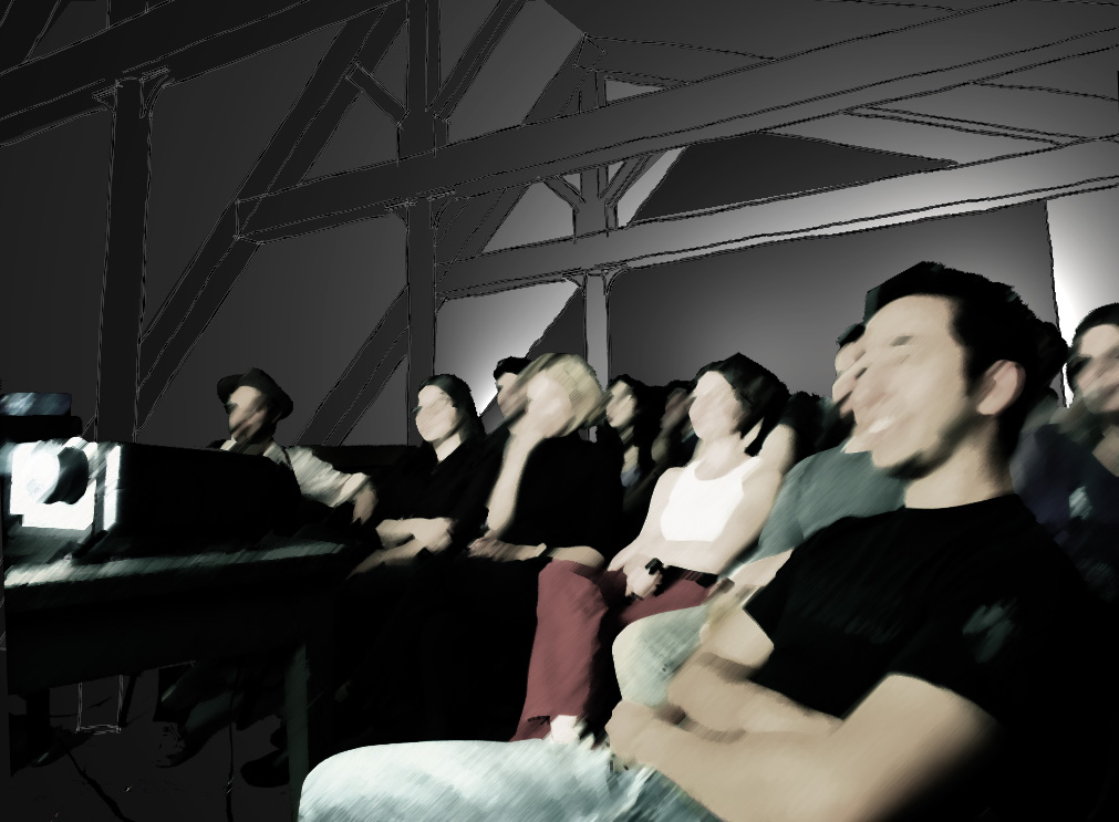
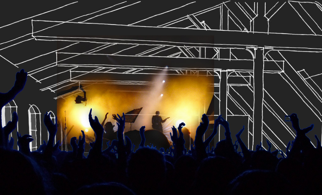
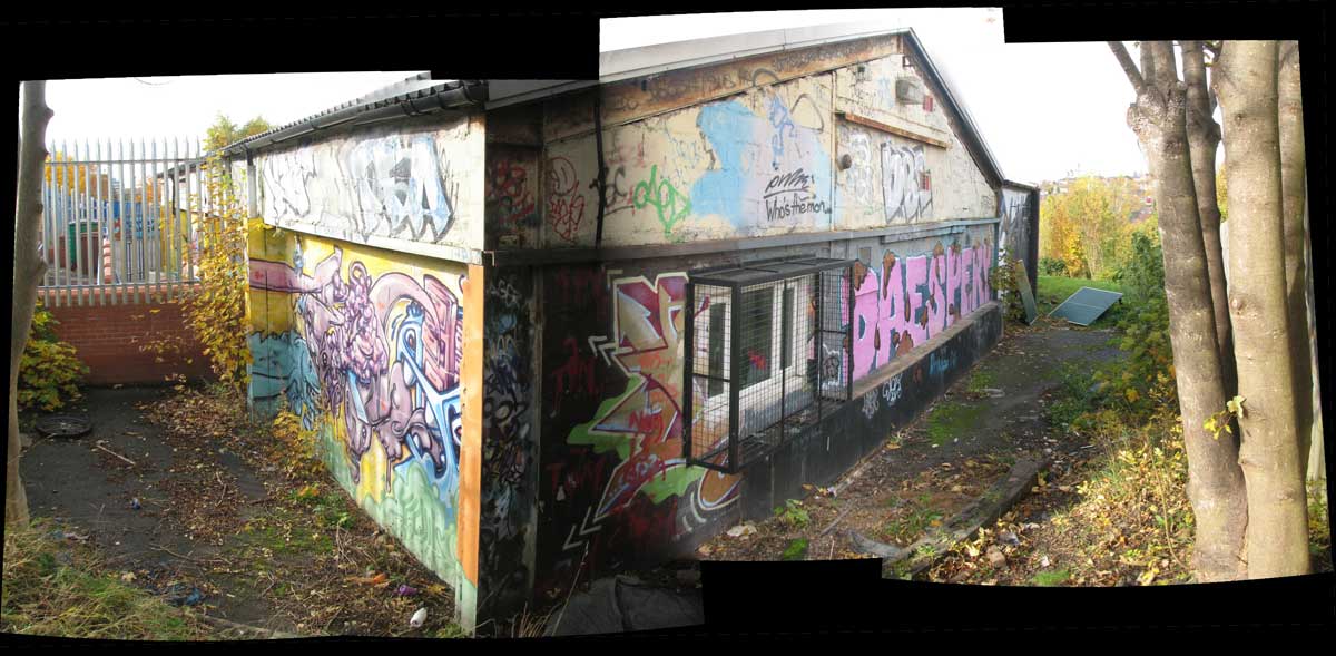
We’ve had a chance to find out more by getting involved with the 1 Thoresby Street building, part of BioCity where the Stand Assembly artist studios, and the influential Moot gallery (which recently disbanded) have been given space. It’s a vibrant place with artist studios and several galleries from the poster-sized Keep Floors and Passages Clear, to the bedroom sized Trade to the 180m2 attic space. It was the Reading Room for the fantastic Hinterland project, a base for experiments in projection from Annexinema and is now the base and a major venue for the upcoming Sideshow — the British Art Show fringe event.

We’ve been helping the artists to get to grips with their building, making something workable, safe and with a strong identity on a minimal budget and, with the future of the building uncertain due to development and road widening plans, probably temporary. It’s a work in progress and an association with the art scene in Nottingham that we hope will continue. For us, it has also spawned a collaboration with artist Tristan Hessing on a piece for the Lincolnshire coast.

At 1 Thoresby Street an empty, wasted and forlorn building has had new life breathed in to it. We urge you to get down there to catch some Sideshow events, which run from 22 October to 18 December.

Creative spaces in schools

Tom Hughes

Working with Creative Partnerships, artists, teachers and school pupils, we have explored the idea of creativity and how spaces can be made which support creative activities. While space in schools is traditionally divided up using subject and year-group boundaries, educational theory is increasingly coming to recognise the value of project-based creative work.

"How will schools of the future adapt to support new ways of teaching and learning?"

We were approached by Creative Partnerships (now known as The Mighty Creatives) to get involved in two projects in local Nottingham schools.

Initially attracted by 2hD’s user-centric approach to design and interest in active consultation, artists working at Mellers Primary School asked us to help in the process of involving teachers and pupils in imagining a future creative space. We worked initially with the staff and artists to open up a conversation about ‘what might be’ at the school, understanding the problems of the existing building but also making the potentials more apparent. We then observed the work of the artists with the pupils, compiling and analysing some of the outputs from that process.

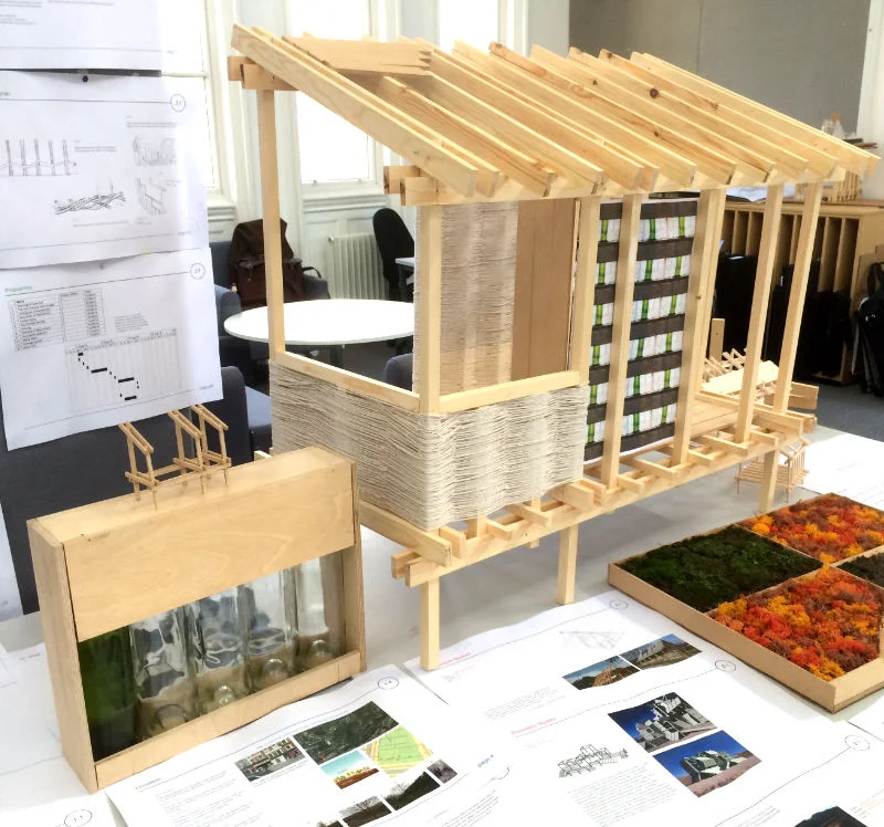
A second project followed at Manning Comprehensive School for Girls, an intense collaboration with a teacher and group of sixteen Year 9 pupils. The objective of the project was to explore the nature of ‘creativity’ as it relates to our work as architects. We ran a live design project with the pupils, taking them through the process of converting an existing crafts room into a flexible creative space.

Using examples of our own processes, inspiration from books and a visit to the art and design studios at Nottingham Trent University, we enabled the pupils to develop, present and debate their own design ideas. This culminated in an exhibition at which pupils from the whole school could vote for their preferred design of the new space. We then took those design ideas and worked them up into a presentation which will be used for fundraising to build the project.

2hD’s impact was in developing a lasting understanding of the creative processes and demonstrating to young people that creativity isn’t just about having good ideas. That has to happen within a framework of understanding the issue, consulting others and evaluating how far your ideas meet your original intentions.

2hD also acted as a bridge between the school and higher education which had a significant impact on the girls.
Jo Gogelescu, Deputy Head at Manning School for Girls

iHub competition

Thibaut Devulder

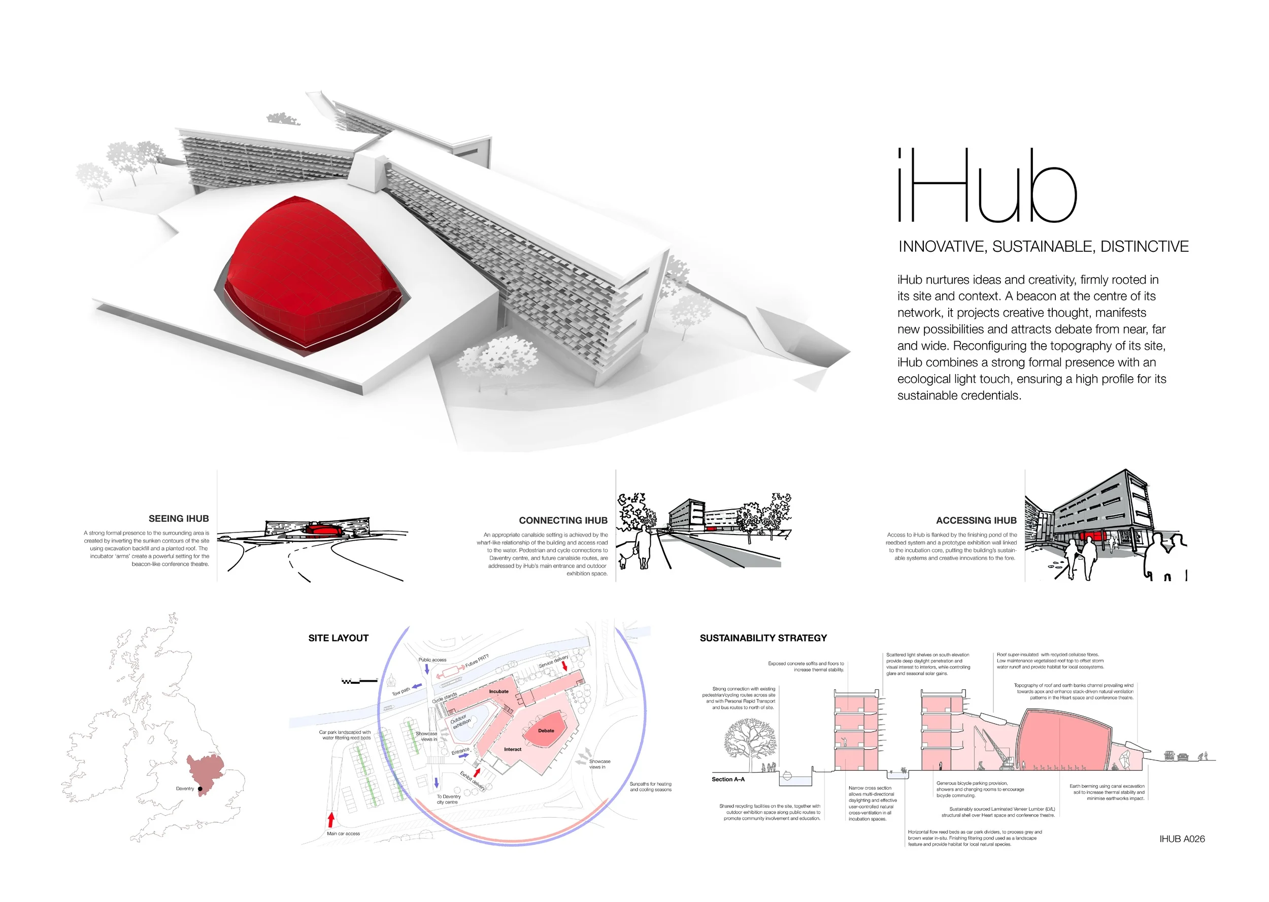
This joint entry project, involving 2hD, Boden Associates and Shared Design, provides a beacon for projecting creative thought through a strong formal and spatial presence, connected with the surrounding canal, road and cycle routes and characterised by a light ecological touch.

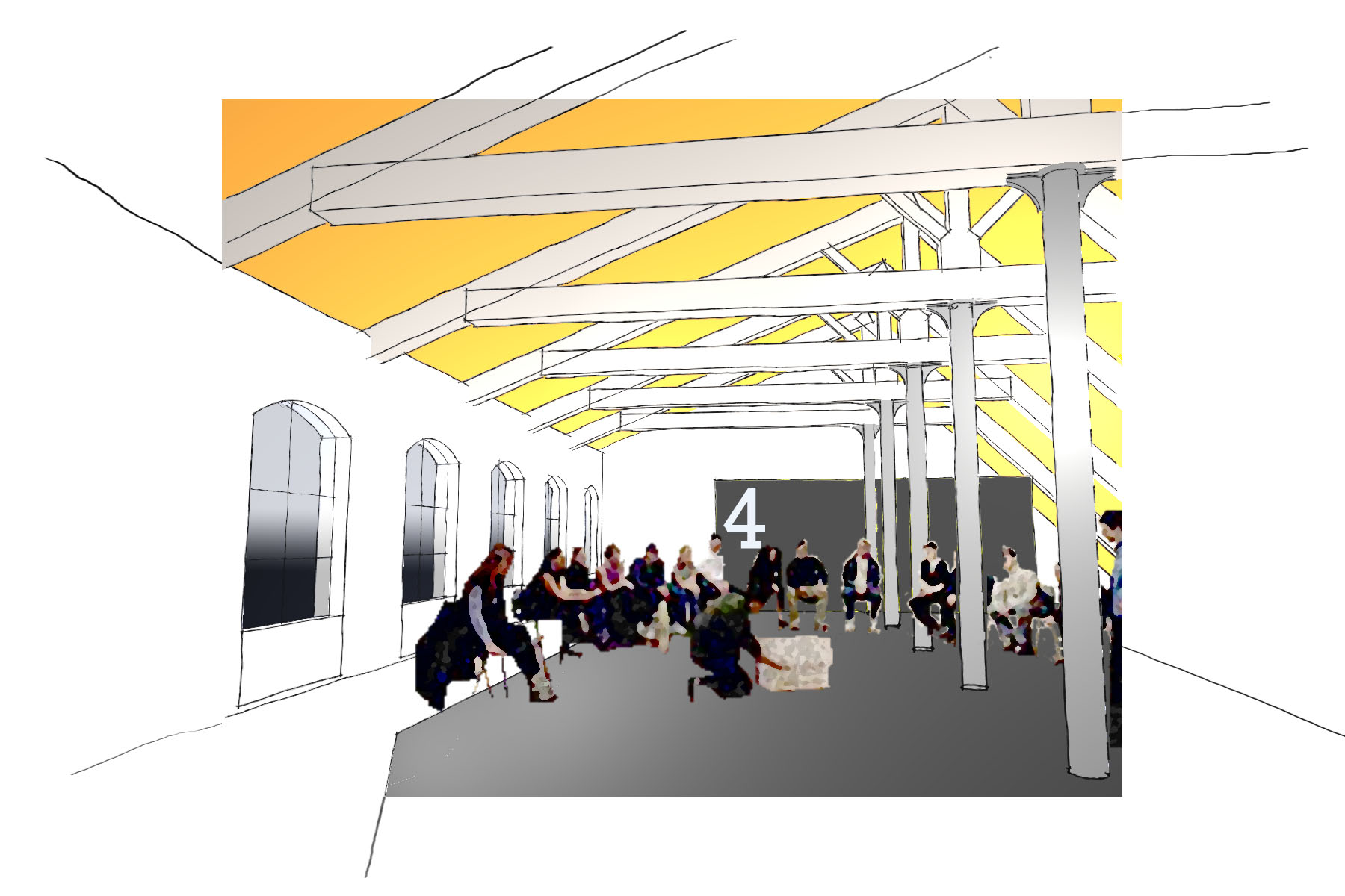
The Heart of the iHub: a brightly coloured conference theatre in the social exhibition space

This Building Research Establishment (BRE) competition called for an innovative hub and office building to link centres of excellence in the built environment with entrepreneurial business in order to promote innovative and sustainable technologies. Submitted designs were also encouraged to connect the local town community with the building and its agenda of sustainability and innovation.

The brightly-clad conference theatre pod sits within a highly flexible and dramatically-lit exhibition space, which in turn acts as the activity heart and connective node of the complex. The greened roof above the exhibition hall innovatively reconfigures the site topography providing a new habitat for local ecosystems and driving the natural ventilation inside. 

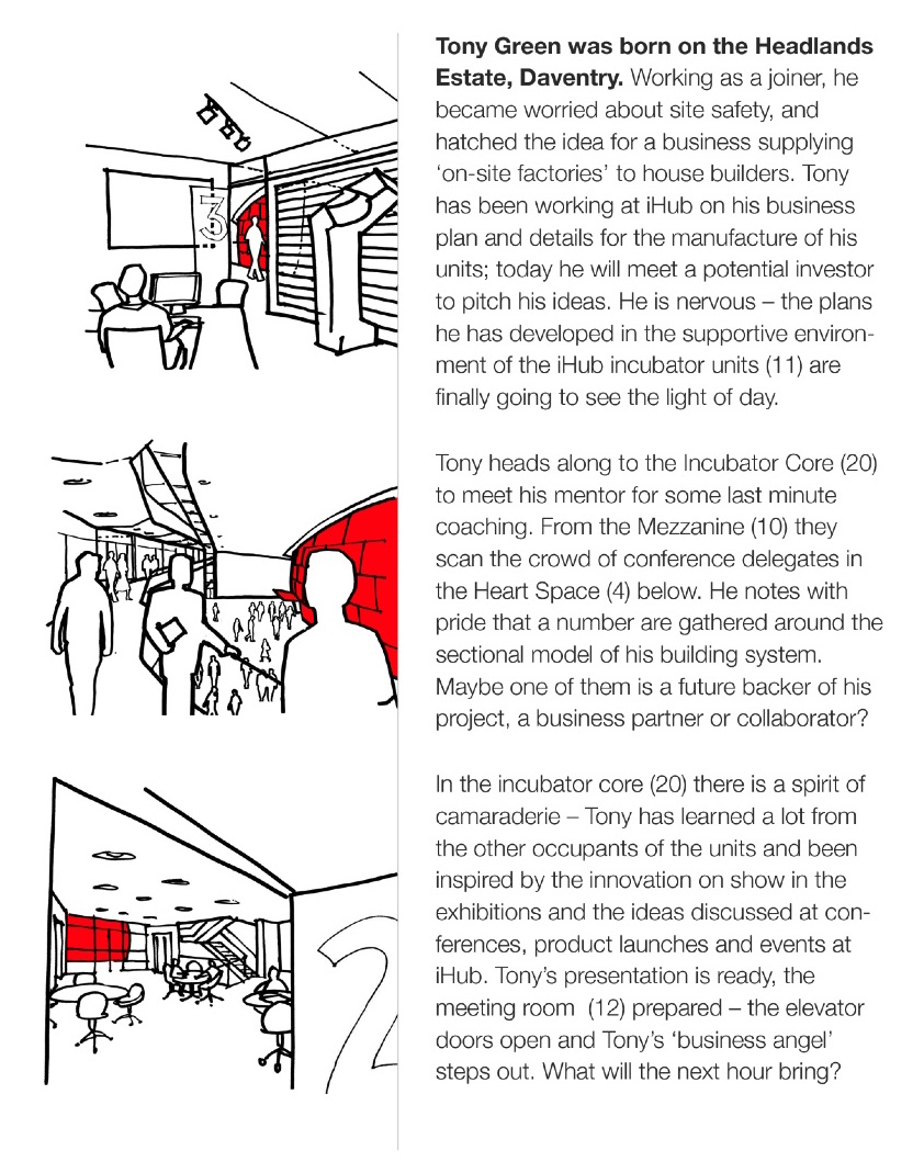
For this competition entry, we extensively used storyboarding techniques to communicate the social dynamics of our proposal. In particular, we presented the way the public would experience the spaces, from the dual perspectives of two fictional characters meeting at iHub: Tony, a resident innovative builder, and Deborah, a potential investor visiting the centre.

Our key achievements in this project:

  • establishing the right level and pattern of connections with the local town

  • distilling the client’s main values needing to be addressed in the project

  • establishing the relational logic of the set of activities to be accommodated

  • determining a fundamental and innovative sustainability strategy

  • marrying sustainability aims with an exciting experience of visiting or working in the building


Sneinton Trail map

Thibaut Devulder

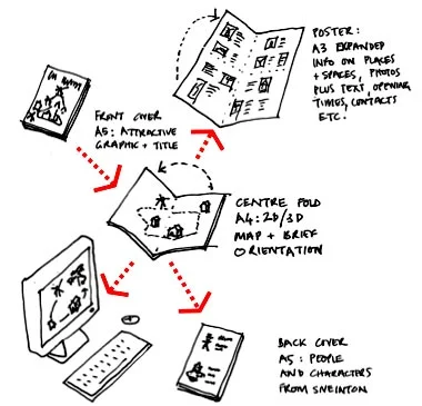
To tell visitors and residents the hidden story of the neighbourhood of Sneinton, a local social enterprise asked us to create a 3D visualisation of the area, where we also live and work. This formed the centrepiece of a printed brochure promoting a tourist trail around Sneinton’s historic attractions. 

The final map, carefully crafted to be accessible and engaging, while still representing enough information for orientation and navigation
We have had a long term involvement with Sneinton Alchemy, a local social enterprise dedicated to making Sneinton a better place to live and work. The Sneinton Trail was one of their projects, inviting local people and visitors to discover the jewels hidden in the winding streets surrounding George Green’s famous windmill.

Teaming up with Nottingham Essence, who gathered information about the local history and took care of laying out the brochure, we set about creating an accessible and engaging “treasure map” for our neighbourhood.
We were keen to get across a sense of the landscape and built form, something that is often missing from standard tourist maps. We started by creating a three-dimensional computer model of Sneinton, which served as a basis for the design of the map. Some extra visual survey and on-site sketches brought life and visual clues into the model.

The exercise then became a subtle exploration of alternative presentation techniques and colour schemes to strike a balance between, on one hand, keeping the map as simple and readable as possible and, on the other hand, providing enough details for the visitors to easily orient themselves and navigate along the trail.
The finished brochure was distributed to all residents of the area, inviting them to go and explore their local heritage. You can also get a free copy of the brochure at many of Nottingham’s tourist attractions, and of course at Green’s Mill!

We created a simplified 3D computer model of the urban space by mashing up scaled maps and on-site photography and sketches

We created a simplified 3D computer model of the urban space by mashing up scaled maps and on-site photography and sketches

We helped Sneinton Alchemy put together a funding bid for the project by visualising the finished product, explaining the strategy and outlining the community benefits.

We helped Sneinton Alchemy put together a funding bid for the project by visualising the finished product, explaining the strategy and outlining the community benefits.

I enjoyed working with 2hD on the Sneinton Trail leaflet: they brought a range of professional experience but were always open to incorporating other people’s ideas!
Colin Haynes, collaborating local historian