Portfolio project
A seaside cabin in Hvitsten

Thibaut Devulder

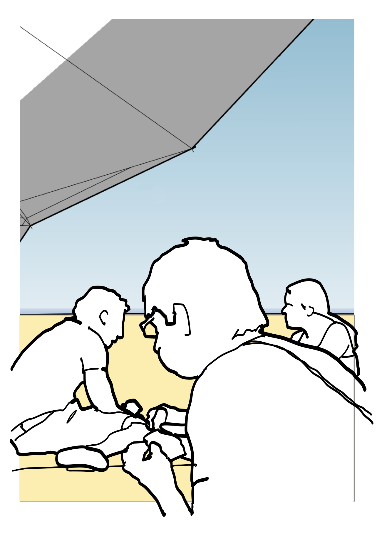
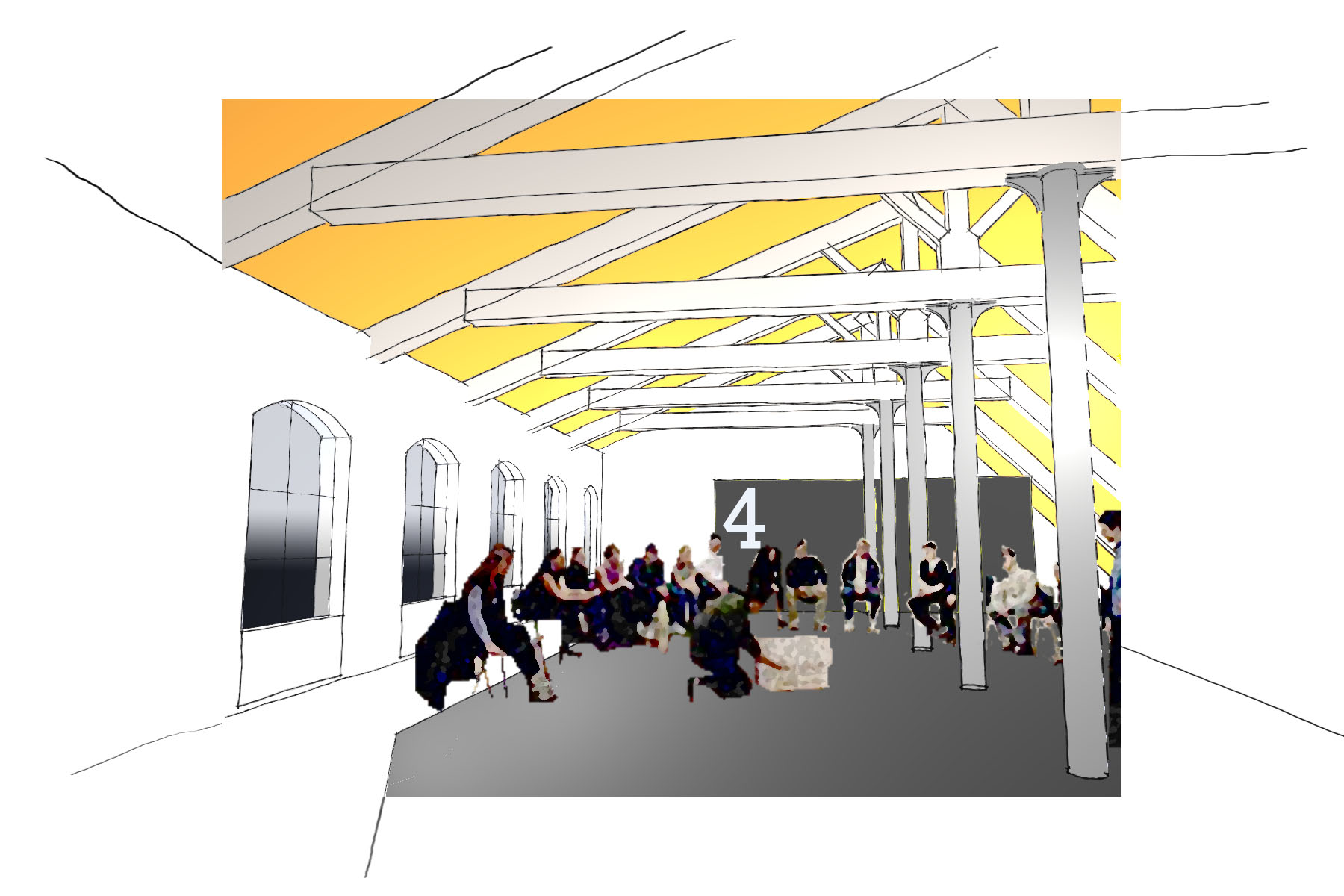
Sketch impression of the remodeled cabin, looking at the fjord from the playroom

We love to design cabins, as they bring together so many of our design interests.

First, our predilection for architecture in remote (and often sensitive) natural locations, to create small thresholds where man meets nature, where minimal environmental footprint and limited access call for an economy of means.

And we are fond of designing tiny spaces — creating places rich in human interactions and intricate functions where people can really "key in" with the architecture, bringing back the simple joy of being together, sheltered from the elements.

But as importantly, cabins also act as social nodes where the complex community of the different generations in a family or in a group of friends congregate, each with their different needs, expectations and desires, making for a challenging but fascinating briefing process.

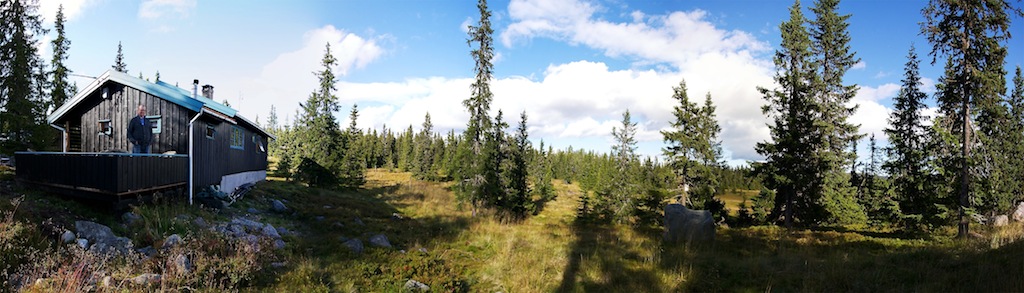
This redesign of a seaside cabin in Hvitsten, on the shore of the Oslo fjord, brought all these aspects together and was a nice counterpoint to our earlier design of a skiing winter cabin in the mountains of Hedmark.

A small stream flowing between the existing cabins
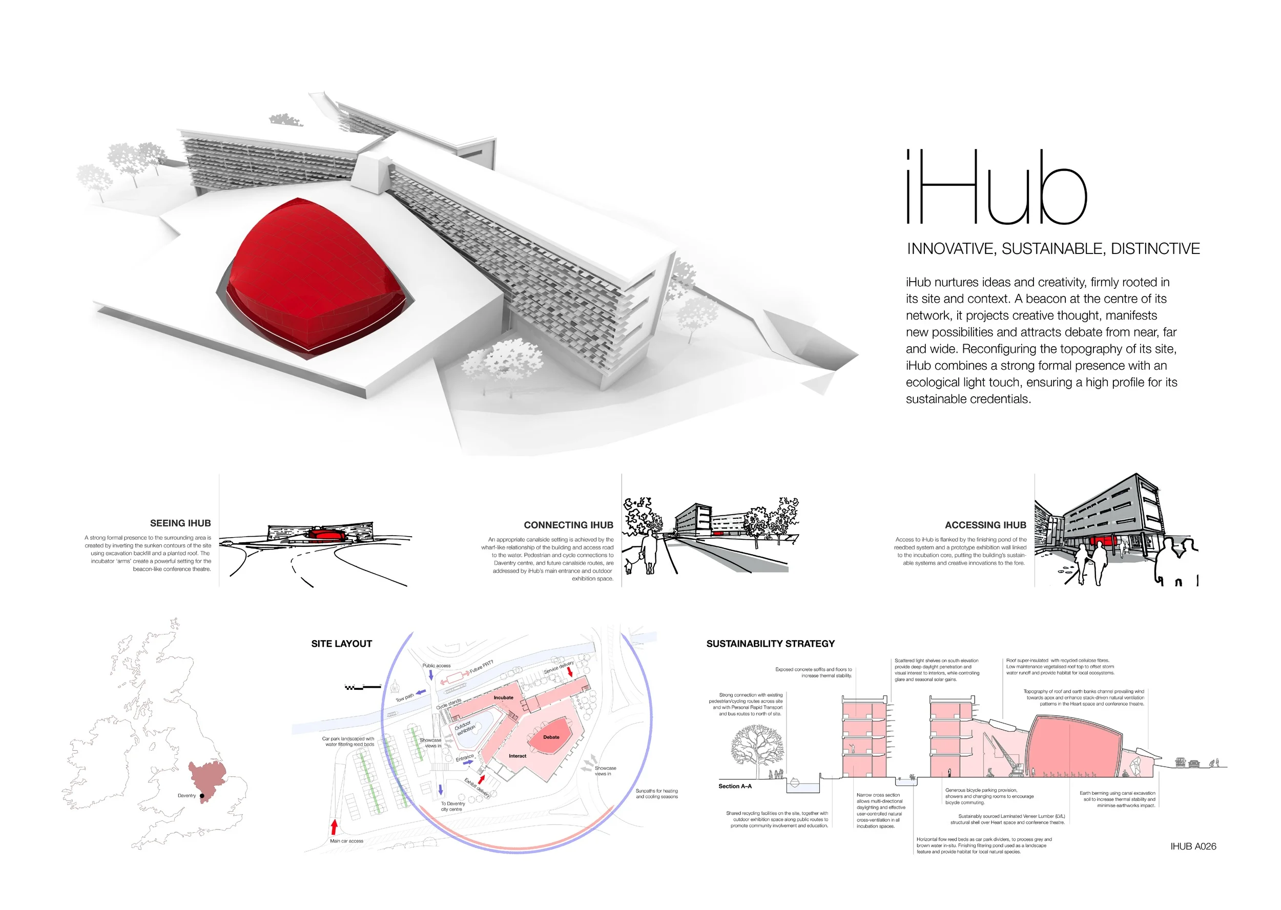
About the project

As is often the case with Norwegian cabins, our clients for this project spanned over three generations. Initially built in the 1950s by the great-grandfather, the summer cabin and its small sleeping annex have been used ever since by the family for spring and summer holidays.

The extended families are now struggling to all fit in the cabins, which has become both too small and in need of repair. Now retired, the grandfather and his partner also want to use the cabin a lot more throughout the year, so they needed the uninsulated cabin to be upgraded for the winter climate and wished to have a real bathroom installed.

All had cherished childhood memories of the cabin and wanted to preserve as much of its exterior aspect and rustic character as possible. So, their requirement to comfortably fit in up to twelve sleeping guests for occasional extended family gatherings called for inventive remodelling and renovation, considering their tight budget!

Looking at the existing cabins

Perched against a steep rocky hillside overlooking the sea, the cabins face south-west into a breathtaking view of the Oslo fjord and its slow ballet of sailboats and cruise ships.

The Oslo fjord, as seen from the main cabin

Plans of the existing cabins

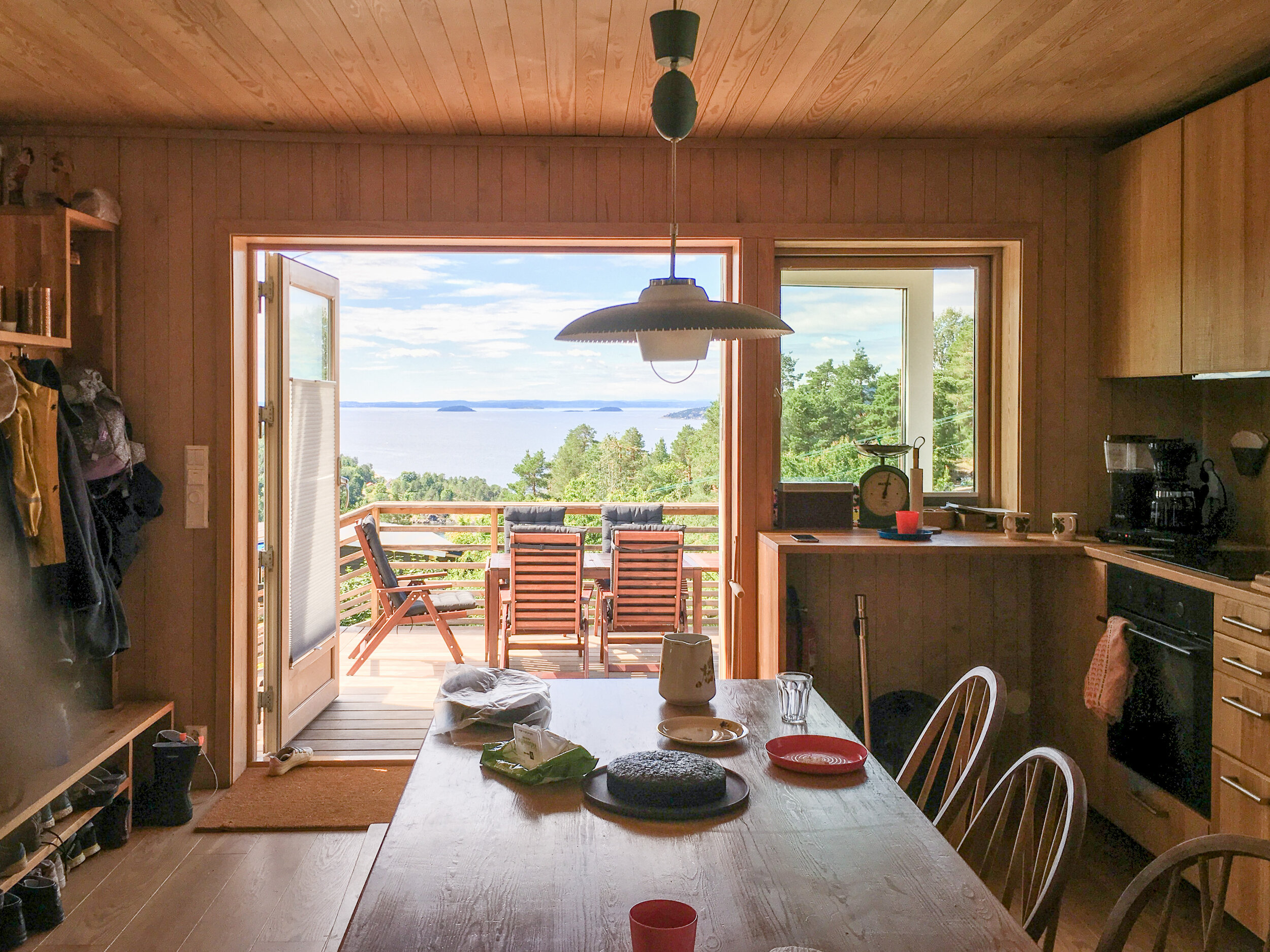
In the main cabin, the small living room actually had a large window opening towards the fjord, but the kitchen and meal area — central to family life in the cabin — were situated behind it, in the darkest part of space of cabin, right against the rock face to the north. The other facades of the cabin were essentially blind because of a small hallway and the two bedrooms to the west. As a result, the main daytime social spaces had no visual connection with either the covered porch to the south-west or the sleeping cabin to the west, both of them often used in the mornings and evenings for informal meals and drinks.

Typical of spaces with light coming from only one direction, this configuration made the living room and meal area appear strangely gloomy, as the large window created a glare effect in contrast with the other darker and unlit interior surfaces. Built to look straight onto the fjord through this large window, the space had only short interior perspectives, making it appear more cramped and small than it actually was.

Situated a few meters downhill and to the west, the sleeping annex had a quiet simplicity to it, nested in the overgrown vegetation and straddling a small stream in the rocks. Unfortunately, an improvised shower had been installed inside a few years back without proper ventilation and created damp problems, so that in addition to being overcrowded, its sleeping rooms had also become uncomfortable.

Welcoming everyone

The initial plan was to integrate the existing porch into the main cabin, to create an extra bedroom. While this made sense to accommodate more guests, we all agreed that this compounded some of the existing problems, in particular closing off the main cabin from the fjord.

From two to fourteen sleeping guests! (click for full size) 

Turning the problem around, we actually removed one bedroom from the main cabin, thus keeping only one for the most frequent occupants of the cabin: the grand-father and his partner.

We carefully checked the feasibility of our proposal by preparing a comprehensive list of use scenarios, from one couple to up to fourteen sleeping guests! We found that moving the shower out of the sleeping annex, ventilating it properly and making some slight adjustments to its interior layout and bedding would allow eight people to comfortably sleep there. All this could be done at minimum cost, so that most of the available budget could be dedicated to the main cabin.

Now remained the task of optimising the shared daytime spaces in the main cabin. And this was essential: every parent can imagine the intense atmosphere when up to three families, including young children, are stuck together indoors for a whole rainy afternoon! Thus, in addition to creating functional living quarters, we also needed to organise sub-spaces within this small cabin, so that everyone could define his or her comfortable own space.

A niche in the rocks

We approached this task from two different angles.

Our design strategy for the remodelling the main cabin, drawn over the plan of the existing cabin (click for full size).

First, we created two different sub-spaces: one for the adults, facing the fjord, more social and relaxing, and one more playful for the children, cradled against the vegetation of the shaded cliff face. These two spaces intersect around the dinner table, the natural converging point for the whole family.

Then, we connected these spaces to the outdoors by nesting these sub-spaces around generous openings — not just towards the fjord, but also towards the sleeping cabin wrapped in overgrown vegetation down to the west, the mossy rocks at the north and the sunbathed terrace to the south — to create a dual feeling of spaciousness and enclosure.

Sketch impression of the remodeled seaside cabin, looking across the living room

Although the main living space remains compact, it feels opened to the light patterns and textures of its natural surroundings.

Frequently eating out during the summer months, the kitchen and dining area extend out onto a terrace that is stepping down, so as to maintain unobstructed views of the sea horizon, even when terrace parasols are used or the large awning on the south facade is deployed. The terrace also acts as a connecting point between the main cabin, the play garden and the shaded path to the sleeping cabin.

The proposed plan for the main cabin (click for full size)

Fitting it all together

Space was very limited inside the main cabin, so we concentrated most of the storage along the west wall, designed as a large oak surface perforated by the kitchen and large window niche where children can sit and play. To make sure that everything fitting nicely, we produced a detailed specification for these densely fitted interior — both in Norwegian and in English, at the clients' request.

We love to involve our clients in the building process. And since one of them is keen on woodworking, we had a design session together to develop together the design of open screen between kitchen and sitting, which also will also integrate coat/shoe storage, seating, a book shelf and the TV equipment. He will later on build it himself.

The very basic existing drainage and electric systems were upgraded to cater for the new bathroom and appliances. The cladding was damaged and needed replacing, so we insulated the whole building fabric and fitted new energy-efficient windows. Along with a flexible shading system and ample provisions for natural ventilation, our clients will be able to enjoy their cabin all-year round!


Portfolio project
Squint: a micro-exhibition module

Thibaut Devulder

Mining some of our old files recently, we dug up this little gem from 2006: a mobile exhibition module we called Squint. It's an installation we originally designed for a competition in Calgary, for the temporary transformation of an urban space situated under a railway bridge.

Squint in the streets of Calgary (from our competition entry in 2006)

Excited by the idea of the self-building something we would then send to the other side of the world, we took the approach of a foldable crate system that could be deployed in an unlimited number of configurations, playfully modulating the openness — or enclosure — of the micro exhibition space it hosted.

Set on its site and then manipulated by the public, the articulated and perforated little structure offered glimpses of its content to passers-by, "leaking" some of its content to the surrounding urban space.

In another context: Nottingham's Exchange Arcade...

And of course, for easy transportation, the whole thing can be neatly folded into a tiny, self-contained crate containing both the panels and the exhibition materials, ready for shipping!

This was a fun little project and maybe something to prototype again?
Interested? Get in touch with us!

Portfolio project
A skiing cabin on Sjusjøen

Thibaut Devulder

Entrance of the existing cabin

Planning permission has been granted to our project on the stunning settings of Sjusjøen, north of Lillehammer, Norway.

Overlooking the well-known Norwegian cross-country ski resort, this small mountain cabin, built in the late 1960s by the client's parents, had become too small for her extended family. The client wanted to remodel and extend it to accommodate family gatherings. With no running water in the kitchen and only two sleeping spaces, the cabin also lacked sufficient indoor storage to accommodate more than two guests.

Emotionally attached to the cabin, the client wanted our intervention to address these issues, yet preserve the modest scale of the building, as well as most of its interior and exterior finishes and furniture — some of them hand-made by her father.

We tackled the challenge by extending the cabin towards the west. Shifting the entrance to the other side of the cabin greatly simplified winter access, avoiding snow drifts from the roof and reaching out closer to the car parking space. More importantly, this allowed us to create a central spine running through the extension.

Linking together the extension and the existing cabin, this spine accommodates extensive storage spaces serving the master and guest bedrooms, where luggage can be droppped on arrival without cluttering the living rooms.

Clad in timber slats, contrasting with the other materials of the cabin, the spine acts a functional and visual link between old and new, sheltering the sleeping quarters from the common spaces.

At the end of the spine, minimal reorganisation of internal partitions allowed for a compact and comfortable kitchen and bathroom, with minimum alterations to the existing plumbing.

The wind lobby and storage were moved from the original access to the new entrance, with the addition of a ski preparation room. In their place, a new living room was modelled into the existing building fabric — opening up the cabin to the fantastic views to the wild marsh on the east and the sun's warmth to the south.

Externally, the extension matches the scale and appearance of the existing cabin. The two bodies however are connected by a section with a lower roof and cladding matching the sheltering slats of the existing entrance, clearly identifying the new from the old.

Inside, most of the floor and wall finishes of the existing wing are preserved. The new spaces, to the west and south, however, contrast with their sloped ceiling and stained boarding.


Portfolio project
Self-build house on a Norwegian hillside

Thibaut Devulder

The single-family house we designed on a hillside of Eidsvoll, in Norway, is now under construction by our self-builder client. Created as two wings intersecting with the landscape, the design reconciled our clients' wishes for both discrete privacy and openness to the surrounding woodlands.

Sketch impression of the house with its two intersecting wings, from which the terraces cascade into the forest

Moving out of their current undersized house in the same town, the family wanted to settle on one of the plots owned by the family (we helped the client masterplan this area back in 2011). The plot is situated on an ideally oriented hillside with woodlands at its doorstep and great views to the surrounding countryside.

We designed the family house to clearly separate public spaces receiving visitors (including a small home office) and the more private parts of the house. These two realms are organised in separate wings, articulated by two intersecting gables. At this intersection, an open atrium links the two levels and a sheltered outdoor porch opens up towards the adjacent woodlands to the south-west, stepping down into the landscape through a series of cascading terraces.

Interior view of the atrium, at the intersection of the two wings (Photo @ Caroline Prøven Brohaug)

The external form of the house also responded to the height restrictions of the local planning rules and the steep site slope. Despite the site steepness, the house benefits from a full wheelchair access to all key functions of the home.

Privacy from the existing neighbouring apartment building (also owned by the client) was preserved by vertical timber fins along the facade, framing the views and giving a common vocabulary to the different elevations.

Foundation and groundworks are almost completed and the timber superstructure (insulated with natural cellulose fibres) will be completed before the first snow, at the end of November.


Portfolio project
Gaarder Gården

Thibaut Devulder

Our design for a mixed development project in Eidsvoll, Norway, has been granted planning permission and work has started on site in Sundet, the historical centre of Eidsvoll, on the bank of the Vorma river.

View of the existing building in context from the riverside theatre 

View of the existing building from south

Since its original construction, this building has seen its use change several times, from textile shop to (most recently) an indian restaurant, with each conversion bringing its new remodelling and awkward lean-to extensions added to the existing log timber building, further blurring the old and the new into a cacophonic mix of styles and functions.

We were approached by the client to reorganise the building into a mixed use development, including retail spaces on the ground floor and rental apartments in the upper floor. The nearby open courtyard — a great asset in the town's developing centre — was originally left disused next to the existing building. Realising the potential, we proposed to integrate it into the scope of the project, to define an attractive outdoor breakout space that opens up towards the retail spaces and the new apartments above.

Located next to the riverside and neighbouring a listed old dairy building, it was essential to preserve a sense of scale between the proposed higher density development and the street level — masterplanned to become one of Sundet main pedestrian axis.

To achieve this, the balconies and common roof terrace serving the seven apartments help to break up with the different built volumes on the site and create an interplay of different levels. The courtyard frames the view to the old dairy building facade from the street, sheltering technical areas out of sight from the street (waste storage and heat pump exchangers).

The palette of materials also help to clearly define the original part of the old building from its rebuilt extensions. The main body of the building will be reclad with its original light boarding, with roof form and windows restored based on old photography. In contrast, all rebuilt and new parts have flat roof and are wrapped in dark stained timber rainscreen.

The first phase of the project is now under construction, including the remodelling of the main building and reconstruction of the extension, to host a retail space on the ground floor and four apartments on the first and loft floors.

Portfolio project
Porch that turns a house around

Tom Hughes

We've been working on the remodelling and extension of a Suffolk cottage for some time now — starting with our 2009 RIBA award winning artist's studio. An internal reworking of the ground floor has improved circulation, usable space and natural lighting.

The final element is now on site: a glass and steel porch at the back door will create a generous welcome space and energy-saving draft lobby.

We often find with existing houses that the 'back door' is in fact the main access for family, guests and deliveries alike, and a decision has to be made: reinstate the status of the front door, or accept the established usage and make the back door a decent point of arrival?

In this case the 1980s flat roofed 'garden room' extension to the rear of the house - with improved windows and insulation - has become the main area for entertaining guests; the new porch will turn the house around and connect it all back together.

Portfolio project
A barn conversion in Dordogne

Thibaut Devulder

We were delighted when Mélanie and Béranger approached us to help them convert an old stone barn in south-west France into their new family home. This was the perfect project to combine our interests in sustainability, self-build construction and conservation.

Sketch perspective of the converted barn, looking across the main living space

We worked closely with our clients to design a beautiful but affordable house, with a flexible layout and minimal environmental footprint. We brought together the different requirements of their family project, unveiling the stunning character of the 200 year-old stone building, while responding to the practical requirements of its new use.

The 200 year-old barn, before the conversion 

Preserving and enhancing

Our initial task was to carry out a detailed measured survey of the existing stone barn and a careful condition survey to establish the need for repair and conservation work, so that our new intervention could fit around and preserve the old wood and stone structure. This also helped us understand the key views, approaches and landscape requirements for this conversion project, to preserve and enhance its integration in the surrounding nature.

The vast and the intimate

We wanted to preserve what we experienced on our first visit to the original barn: an impressive feeling of spaciousness with a peaceful daylight filtering softly through the fallen roof tiles... This meant establishing a clear hierarchy of indoor spaces, so that the whole range of specific functions of the barn's new domestic use could be accommodated without overcrowding the attractive indoor volumes.

The barn under construction: the new insulated roof and the repointed stone walls.

The other challenge was to introduce natural daylight deep into a previously dark agricultural building. To respect the traditional architectural topology of the stone barn, we concentrated the new openings into few, larger light wells: they reflected off the light surface finishes and created contrasts between social spaces — opening up to the hight roof structure — and the more intimate private rooms. This also promoted effective natural ventilation across the barn in summer.

We chose to keep as much as possible of the meter-thick stone walls in the interior, and insulated the new roof cover and floor slabs. Hovering within the stone volume is a secondary timber structure that weaves itself around the oak roof trusses, clearly identifying the new from the old and contrasting the textured historical materials with the contemporary new ones.

Harnessing the site’s resources

Carefully balancing the client’s lifestyle choices, budget and aspirations, we designed and implemented design sustainability measures that we knew would work and could gracefully integrate with the historical building. This meant low-tech solutions with proven track record, that used resources readily available around the site.

Making the most of the barn's extraordinary thermal mass, we incorporating radiant underfloor heating in the newly insulated floor slabs and connecting it to a central wood boiler, running on locally harvested wood logs.

The vast roof was also ideal for rainwater collection, and the system we designed made the barn virtually independent for all water needs (including drinking water!). And while re-landscaping the surrounding agricultural land, we designed a complete waste treatment system based on reed-beds, a completely natural process that would purify all waste water from the family — and even transforming it into clean water for their new natural swimming pond!

Client, user, builder...

A key feature of this project is that the clients will manage the building process themselves, so we carefully phased the construction to make sure that the house would be comfortable and accommodating during the process, which may take years to complete. We also attentively considered the family’s cashflow over time, and their future aspirations and projects (the house will eventually double as a guesthouse).

The different stages of the construction, each inhabitable and addressing the specific needs of the growing family (click to enlarge). 

So the new home is designed from the start into a series of stages that will evolve with the family, all the way from a space to park a caravan on the site! At each building stage, the plan and structural system work together to create comfortable habitable spaces, building in flexibility as the work progresses, so that later disruption can be avoided.

One of our "assembly manuals", explaining to the clients how to build the self-standing internal timber structure (click to enlarge)

Sharing knowledge and experience

We extensively used SketchUp to communicate with our self-building clients, providing them with updated detailed 3D model of the design. Since they had no former experience in carpentry, we also created a series of clear and user-friendly visualisations to explain how the different parts of the structure fitted together with simple assembling techniques and components that could be lifted and handled with limited equipment and muscle-power!

Rewarding their amazing building skills and painstaking attention to details, our clients were even elected in 2012 Self-Builders of the Year by the French magazine Autoconstruction!

The construction of the barn is still in on-going and our clients are sharing in details the day-by-day progress of this project and their self-building experience on their project blog

Thanks to 2hD for their outstanding work!
With the 3D model, we can browse, move and observe every corner of the building: a true manual that allows us to reproduce on site what has been imagined by the architects.
Béranger Hau, client and self-builder

Portfolio project
A low-energy house in a conservation area

Tom Hughes

Replacing a 1980s bungalow on an infill site in a Nottinghamshire village, the design of this house had to complement the Conservation Area setting whilst achieving extremely high performance as a “zero carbon in use” eco-home. Designed using the PassivHaus Planning Package and executed in a palette of brick, oak, slate and zinc, the house includes a central frameless glazing porch and open stair, an integrated balcony and an extensive built-in photovoltaic array.

The south facade, designed to maximise winter solar gains while providing shading in summer, . Photovoltaic panels and rooflights are integrated into the slate roof.

Our client required a contemporary home that could be built to achieve extremely high energy performance in use. Their site was carefully selected within a characterful village setting, approached from the main village street to the North and having a good southerly aspect for solar collection. Alongside the development of our client’s brief and requirements, we carried out a careful analysis of the village layout and the materials and massing of surrounding buildings.

The house has performed well and we are very happy with its aesthetics, comfort and technical performance. It blends in well with the village despite being obviously modern. Many passers by stop to enquire and pass comment on the house, usually very favourably. We often see cars slowing down in the road outside, almost stopping to catch a second glance.

All the energy bills for the first year of occupation, plus the running of an electric car and water rates, were covered by the return from the solar panels, leaving us only Council Tax to pay!
Roger Bell, client

In a sensitive planning context the design was developed in close consultation with the local planners and community, documented through an in-depth Design and Access Statement. The delicate balance between achieving PassivHaus design targets and satisfying Conservation Area planning requirements meant that the design was evolved and presented in various contexts. A consultation on site in the existing bungalow saw a 20% turnout of the village giving unanimous support for the scheme.

The design uses the north facade to address the village setting and large windows and solar roof to the south to maximise useful solar gain and collection. The requirement to reduce north facing glazing to meet PassivHaus design targets is offset by the provision of a frameless-glazed porch, which prevents the escape of warm air whilst providing an open welcome to visitors.

The North facade and street front, a contemporary response to the surrounding buildings of the Conservation Area.

The smaller windows and variegated massing on this side of the house respond to the scale of the village, whilst the private rear of the house presents a single expanse of roof for solar collection, free of any self-shading projections. An integrated system of flush-fitting photovoltaic panels and rooflights was selected to create a smoothly integrated roofscape. Excess heat gain is controlled by the use of integrated external louvre blinds to the large sliding glass doors on the south elevation.

The integrity of the design is maintained by the simple palette of materials: red brick, oak cladding and beams, slate roofs. A small area of zinc roofing over the glazed porch expresses the articulation of the house plan around the double-height circulation zone.

This project was shortlisted in the 2014 RIBA East Midlands Awards.

Design overview (click to enlarge).

Project credits

Contractor: Nick Martin with Branch Construction
Executive architect: Parsons + Whittley


Portfolio project
The Lost Cuckoo

Thibaut Devulder

We have put together this short video about our Lost Cuckoo project with artist Marcus Rowlands from the DVD produced by the Lakeside Art Centre, who hosted the event last year.  The project was great fun and we are looking forward to developing this concept in other art festivals this year!

A public art and participation project by Marcus Rowlands artist and 2hD architects, involving pupils, parents and staff from Brocklewood, Melbury and Portland schools in Nottingham. Funded by The Arts Council, Lakeside Arts Centre and Nottingham Education Improvement Partnership, with support from Faspak and Staples. Original footage and sound by Vent Media. 2011.

The Lost Cuckoo project was commissioned and supported by the Arts Council England and Nottingham Lakeside Arts.

Portfolio project
A stone memorial for a Jewish congregation

Tom Hughes

This project is the result of our combined interests in public art, craftsmanship and education. Starting as a student design competition that we organised at Nottingham Trent University for the Nottingham Progressive Jewish Congregation, our design process became an involved exploration of traditional stone walling techniques and complex numerical modelling to create a solemn yet welcoming landscaped space.

This project was shortlisted for the RIBA East Midlands Award for Architecture 2011.

The completed stome memorial, with collaborating artist Igor Barteczko

We were approached by the client to create a memorial structure for their congregation’s cemetery on an exposed hillside with excellent views over the Trent valley. We proposed, set up and ran a design competition for students, then collaborated with the winner to bring the project to completion. We redesigned the competition winning entry, working with the student in the role of project artist, to ensure buildability and adherence to a very restricted budget.

Our innovations on this project include a rejuvenation of traditional craft building techniques and the use of three dimensional computer modelling to achieve the twisting shape using stonework. We developed a custom plugin for our 3D modelling software to help us explore alternative geometries with the stone masons and produce the required three-dimensional templates for the preparation of the curved ashlar stonework.

The first commemorative plaques, on the curved ashlar.

The resulting structure creates a strong sense of place with an intense focus for ceremonial purposes, whilst also framing views out and welcoming visitors in.

The Memorial viewed from the cemetery entrance.


Portfolio project
Upgrading a 1920s house

Tom Hughes

This project is currently on the drawing board in the practice, and we thought it worth sharing some interesting aspects of the process so far.

We started out with a client with a beautiful property... that is unfortunately an energy guzzler and has a layout that just doesn't work for the family's lifestyle. The house features a half-timbered front and an interior with many Art Deco, Art Nouveau and Arts and Crafts features. The rear elevation however has many problems with the detailing and a too-hot/too-cold (and out of keeping) conservatory.

With ambitious ideas for remodeling and extending, and a great set of intentions to create a sustainable and energy efficient building we straight away knew that this was a client with whom we could do something special. We also know that these kinds of great ideas can sometimes clash with the realities of programme and budget, so we agreed with our clients that the first step would be holistic: to develop an architectural strategy hand-in-hand with budget costings and a sustainability assessment.

We brought Hockerton Housing Project in to create a 'Home Energy Masterplan' for the property. They thoroughly surveyed the existing fabric and identified cost-effective and practical methods to improve the energy performance of the building. Their report identified measures and payback times for a range of approaches, from the 'no brainer' moves that would pay off straight away to the 'green halo' measures that improve sustainability but might not pay off for years or even decades to come. 

We took that information and worked with Branch Construction, an environmentally aware building company, to develop budget costing and buildability strategies on a number of different design options. Having worked out what the current problems were with the house, we developed some ideas for solving them and creating an amazing new home for our client. This centres around a completely remodeled core to the house, linking front to back and interior to garden.


Finally, we rated the options for cost/buildability, sustainability and design – presenting the conclusions as an architectural strategy report. You candownload a public version of this report.

This thorough-going approach has helped our client through some tough decisions on the project scope, and the trade-offs between cost, sustainability and payback time. Having established a scheme that can be completed as a Permitted Development (not requiring planning permission) we are now developing the project into the detailed design stage.


Portfolio project
Stranded: extreme picknicking in the dunes

Tom Hughes

In response to the Structures on the Edge competition, we collaborated with artist Tristan Hessing, of One Thoresby Street, to explore the ambivalent relationship between art and nature conservation. We designed a shifting public art installation on the wild beaches of the Lincolnshire coast, on the theme of extreme picnicking.

The Stranded art installation, slowly eroding within the shifting sand dunes of the Lincolnshire coast

Our chosen site: a fragile dune ecosystem, isolated on a windblown seashore.

Stranded was our shortlisted entry for the 2010 Structures on the Edge art programme, and a distant cousin of our Bathing Beauties competition entry.

The artists’ brief called for small permanent structures in the sand dunes of the Lincolnshire coast that would respond to the wild beauty and harsh environment. Our response was to design an installation for extreme picnicking as a robust response to the rugged nature of the site.

Shifting sands

We decided to make our intervention at a dune crossing point, reinforcing and protecting the dune whilst giving views and shelter for visitors as they move between land and beach. Stranded would be a faceted concrete structure whose shape was derived from the dune surface, but with points raised to provide views and shelter, and others buried beneath the surface to provide foundations. We would see it as a geometric abstraction of the dune landscape, a frozen snapshot of the shifting sands. It might be taken for an archaeological artefact that has been exposed, or is in the process of being covered, by the sands.

Our collaboration with the artist

We found that Tristan shared our approach to understanding the project and our chosen site at Wolla Bank. We took our cameras and tape recorders and had a picnic in the dunes. We talked and sketched and thought, but we also interviewed everyone we could — hikers, families, fishermen, dog walkers, bird watchers.

It became obvious that it was the remoteness and rawness that they appreciated. All of them had visited Wolla Bank many times, and they all praised its quietness and undeveloped nature. Rather than change the place by inserting an icon that would signal development, we decided we should intervene in a strong but subtle way in the landscape.

The making

The process of making Stranded would be intimately connected to these intentions. Creating a mould from the sand of the dune, we would dig out areas of the structure which would be ultimately submerged beneath the ground, and build up areas that would be raised. Finally, we would spray on fibre reinforced concrete to form the structure. The process would be like building a giant sand castle — a hands-on process through which we would engage the local community and visitors.

The exposed concrete areas would collect sand and be blown clean so that the structure would change over time, a process that we would document and that would help to explain the life, mobility and sensitivity of dunes to the visitor.

" 2hD have been committed to delivering the highest standard possible at every opportunity in our collaboration, which is absolutely how it should be and the reason why it has worked so well for all parties.
From our initial shared exploration of the site, they were very engaged with my responses and ideas, responding quickly with visualisations and practical suggestions for the making process. The principle of our collaboration was to understand where our common ground was and how best to pool resources and create design without compromise."

— Tristan Hessing, collaborating artist


Portfolio project
1 Thoresby Street art space

Tom Hughes

Nottingham has a thriving arts scene, and over the last few years there has been a swell of artist-led studios and galleries.

We’ve had a chance to find out more by getting involved with the 1 Thoresby Street building, part of BioCity where the Stand Assembly artist studios, and the influential Moot gallery (which recently disbanded) have been given space. It’s a vibrant place with artist studios and several galleries from the poster-sized Keep Floors and Passages Clear, to the bedroom sized Trade to the 180m2 attic space. It was the Reading Room for the fantastic Hinterland project, a base for experiments in projection from Annexinema and is now the base and a major venue for the upcoming Sideshow — the British Art Show fringe event.

We’ve been helping the artists to get to grips with their building, making something workable, safe and with a strong identity on a minimal budget and, with the future of the building uncertain due to development and road widening plans, probably temporary. It’s a work in progress and an association with the art scene in Nottingham that we hope will continue. For us, it has also spawned a collaboration with artist Tristan Hessing on a piece for the Lincolnshire coast.

At 1 Thoresby Street an empty, wasted and forlorn building has had new life breathed in to it. We urge you to get down there to catch some Sideshow events, which run from 22 October to 18 December.

Portfolio project
A pavilion for a Museum of Modern Art

Tom Hughes

2hD were commissioned by the Lille Métropole Museum of Modern Art (LaM) to conceive an innovative pavilion to host the ceremonies, celebrating the museum’s re-opening after five years of refurbishment and extension works.

Challenging the existing negative paradigm of event tents, we designed a diaphanous inflatable textile structure to create a mesmerising spatial experience for visitors to the art museum and a striking backdrop for its high-profile public events.

The pavilion at dawn, against the rectilinear backdrop of the museum (Photo: Yves Morfouace)

The pavilion's diaphanous inflatable skin

Our collaboration with LaM started in March 2010, when the museum invited us to submit ideas for an event structure to host up to 350 people for large scale events, ranging from official receptions to dance performances.

Excited by our proposal of a large scale inflatable structure but unsure about its feasibility, the museum initially commissioned us to produce a comprehensive study covering all relevant aspects of feasibility, including the erection process, structural modularity, internal micro-climate, functional analysis, budget simulations and health & safety.

We then teamed up with Inflate, experienced makers of successful inflatable event structures, to produce a custom-designed pavilion that was versatile enough to host the wide spectrum of events envisaged by the museum and that fitted within the tight budget of this not-for-profit art organisation.

Complementing the orthogonal lines and hard materials of the existing buildings and the urban park surrounding them, the lightweight translucent envelope and organic lines define a transient space between the park’s outdoors and the museum itself, welcoming and orienting visitors in their exploration of the extensive art collections. The pavilion also acknowledges and creates a playful dialogue with the many large-scale modern sculptures inhabiting the museum grounds.

The pavilion is designed to adapt to a wide range of future uses, from public reception to theatre performance.

The structure was first installed in September 2010 to host thousands of visitors for the week long opening festivities. Beyond this, the pavilion will also provide a flexible and iconic new space to host the wide variety of future events to be held on the museum grounds, ranging from theatre performance to public lectures and outdoor interactive video installations.

Press releases and high-resolution images suitable for publications are also available in our press section.

The enjoyment with this wonderful pavilion is so great that everyone — despite the summer weather outside — wants to be inside it, and all faces are lit up with joy!
Barbara Gaul, invited artist from Düsseldorf

Awards

This pavilion received an architecture award from the Royal Institute of British Architects (RIBA) East Midlands in the Out of Region category, in September 2011.

This project has also been shortlisted for the World Architecture Festival Award 2011.

At night, the integrated lighting system transformed the structure into a beacon, softly glowing in the park.

At night, the integrated lighting system transformed the structure into a beacon, softly glowing in the park.


Portfolio project
A painter's studio and home office

Tom Hughes

After retiring from his career as a journalist, our client needed additional space at home and asked us to design a new art studio that could also be used as an office for his freelance work. Our design was Highly Commended by the Royal Institute of British Architects (RIBA).

The studio provides an ideal environment for focused work while establishing a strong relationship with the garden.

This is the kind of project that is set for architecture students as a way of exploring space, light, and client needs, but few get the chance to actually make such a building later in their careers.

Primarily, the need was for space to focus on his artistic endeavours as a painter, but also to allow for freelance home working. This gave us the chance to design for excellent daylight quality and a quiet, contemplative, single person space.

An interesting aspect of this project was that the client had already chosen a local craftsmen builder, so we were able to collaborate from an early stage to achieve an exciting design with confidence that it could be built. The unusual design of the roof and structure, necessary to achieve the quality of space and light that we wanted, pushed the builder into some unfamiliar territory, but he responded with some excellent craftsmanship and produced a building of which he and the client are very proud.

The studio is carefully placed to complete the layout of the garden and to make best use of natural light and views out. The interior space is dramatic for such a small building, but it also has a cosy and relaxed feel, supporting long periods of focused creative work. The building is very well insulated with a small woodburning stove, used only in the coldest times, to provide all the heating needs.

This project has been Highly Commended at the RIBA East Midlands Awards 2009!

Sketches were an essential communication tool throughout the design process, from the early briefing with our client to the discussion of construction details on site with the builders

Our client was delighted with the thermal comfort and the quality of natural light in his new studio

As a freelance journalist and amateur painter I wanted a flexible working space set apart from the house, with a district personality that would, nevertheless, not clash with the village setting. 2hD’s proposals fulfilled my checklist and the practice worked intelligently with us and our builder to realise these ambitions.

The studio is a real joy. Being flooded with natural light and with high levels of insulation, it uses little energy. I seldom turn on the lights, even on the gloomiest of days, and the stove is only lit occasionally, as the building keeps a regular temperature throughout the year.
Michael Hughes, client and user