2hD Director Chris Heuvel appointed RIBA Fellow

Tom Hughes

Our director Chris Heuvel is one of only 15 architects to be awarded Royal Institute of British Architects Fellow status in the 2018 list. The RIBA says of the award that "Fellow Membership gives us the opportunity to recognise our inspirational Chartered Members, the sometimes unsung heroes of the profession, who have made a real contribution to architecture, and the community."

Chris3.jpg

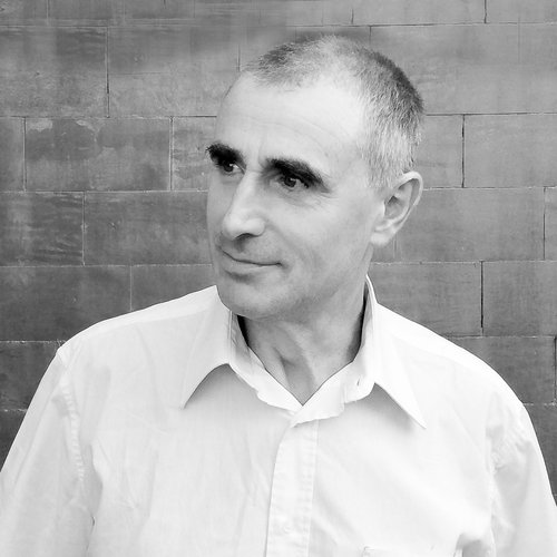
Chris' full citation reads as follows:

"Chris is a Director at 2hD Architecture Workshop and a lecturer at Nottingham Trent University (NTU), where he delivers the professional practice elements of both the undergraduate and postgraduate architectural programmes, in addition to acting as Professional Studies Advisor for students in practice. He also runs the Design Studio module followed by first year undergraduates.

Chris champions architectural education as an integral aspect of professional practice, and is currently undertaking a major research project on behalf of NTU into how practitioners’ engagement with their local communities can be compatible with their business development objectives. All his teaching is substantially informed by a lifetime of active involvement in community engagement projects – previously in Norfolk and now in Nottingham, where (in conjunction with 2hD Ltd) he is currently helping a local group develop a business plan for the revival of their recently closed community centre."

Congratulations Chris, the recognition is thoroughly well deserved!

546 brooms: the making of Mission Control

Thibaut Devulder

Crafting our micro-office Mission Control has been a great opportunity for us to experiment with many of the technologies we implement in our larger projects, such as natural materials, prefabrication, breathing construction and self-build techniques.

Let's look back at how Mission Control was actually made.

 
Bringing one of the 13 prefabricated units on site for assembly

Bringing one of the 13 prefabricated units on site for assembly

Prefabricating the structure

We wanted to approach the making of our new micro-office as a full-scale architecture project and develop further our expertise in prefabrication and self-build techniques.The structure of the building is composed of 13 timber panels that were prefabricated in our workshop situated 50 meters (and 3 door frames! ) away, before being transported and assembled on the site,

One of the prefabrication manuals: we created one for each timber panel

Each panel was designed so that its size and weight would allow two people (Tom and me) to carry it on site safely. To simplify this, we created a small plugin for SketchUp to automatically check this as we modelled the structural panels, as well as to create detailed material lists and clear fabrication manuals for each module.


Assembling the construction

Once fabricated, each module was connected on site to the existing foundations of the former garden shed and to its neighbouring panels. It was then insulated with natural sheep's wool insulation, which was a real treat to install. The whole assembly was finally wrapped in wood-fibre boards for weather-tightness, extra insulation and breathability.

Section through the breathing wall construction

The interior climate is then simply regulated by natural ventilation (adjustable with vents in the door and skylight) and the heating provided by the waste heat produced by our computers. The whole wall construction is vapour-open, complementing the natural ventilation to maintain a healthy and comfortable environment inside. 


Corner detail of the cladding, showing the interlocked broom heads

The broom cladding

The outside of the enclosure was finally clad with a total of 546 wooden broom heads, with natural coco-fibre bristles, screwed to battens wrapping around the breathing walls.

The selection of broom heads as a cladding material has been the result of a careful search for a material that would fulfil all our needs: a natural material with an interesting texture, readily available and affordable, friendly to the touch, yet resistant to break-ins by concealing any opening into the building.

Broom heads actually proved a rather economical cladding materials, as well as creating beautiful shades of browns and greys that evolve with the seasons and ambient humidity, reminiscent of some traditional thatching techniques.

Imagine, design, build and own...

Designing and crafting our micro-office Mission Control has been a long story: we started toying with the idea almost ten years ago! And it has sometimes been a frustrating one, especially when trying to fit this project between our other "more urgent" projects.

But, in the end, this has been an immensely satisfying project and something we are very proud of — having converted our initial idea into an actual architectural space that we love and truly feel our own, every bit of it designed and crafted with our own hands. A project that embodies many of our ethical values and architectural sensibilities at 2hD Architecture Workshop.

Portfolio project
Mission Control: an experimental hairy micro-office

Tom Hughes

Nicknamed "Mission Control", our broom-clad micro-office is an exercise in teleportation, designed to take us from the everyday hurly burly to a another world — one of calm, quiet and focus. 


The inception of Mission Control

Our UK office was a home office — not squeezed in to a back bedroom but occupying a large ground floor room with direct access to the main entrance and the garden. For some years this served us well, but the arrival of children led inevitably to a loss of separation. As any home-working architect will testify, the room with all the paper and colouring pens is a kid magnet!

To some extent, the injection of informality improved things — collaborations became looser, more relaxed and more creative — but we were left with the need for a ‘cave’ to complement our increasingly lively ‘commons’.

Our working practices have always involved two very distinct modes. The first is highly collaborative and semi-structured, requiring large surfaces, space and materials for analogue production of drawings and models. The second, as a counterpoint, requires periods of immersion in focussed digital design and production work. Our existing home office provided ideal conditions for the former, but creating the conditions for the latter was always extremely difficult.


The new office matches the exact volume and footprint of this old shed

Crafting a solution

In the garden was glazed shed, built by the previous owner from repurposed corrugated iron, old windows, offcuts of vinyl and pieces of timber. Rickety in the extreme, we nevertheless blessed it with the name “Mission Control” because it was a great place to retreat to when setting off fireworks on bonfire night.

We decided the replacement for this shed would become our garden office.


The rise of the garden office has been met by a multitude of packaged solutions, and some truly wonderful bespoke designs. But nothing we could find in the market met our slightly odd needs. 

We also felt the urge to make, at 1:1 scale and with our own hands, something that we had designed from scratch. So we decided to embark on a highly personal journey into design and build.

We designed Mission Control as a sort of antithesis of "the contemplation space with landscape views and flowing inside-outside space". We needed a cell, removed from physical context and worldly distraction, where we could retreat to immerse ourselves in brain work.

Our intention was that the building should create three totally separate experiences: an enigmatic exterior, a serene interior and a ceremonial commute to work...


An inscrutable box in the garden

Without any visible door or window the outer facades are entirely clad in natural coco-fibre broom heads: details and junctions are largely concealed, as the broom bristles interlock to provide a continuous and visually diffuse surface. Thus giving no clue as to its status as occupied or empty, the structure existing merely as an object of intrigue.

This is a reverse Tardis: much smaller on the inside than it appears from the outside. The difference in volumes results from the simple shed-like pitched roof hidden behind the parapet. The polycarbonate surface of the roof only pops through the brush cladding to divert — yet eliminates familiar details like fascias and gutters, which would make the box readable as an archetypal shed or garden office. 

The mysterious object, as seen from our collaborative office space

Corner detail of the coco-fibre broom cladding


One of the two focussed workstation inside Mission Control

A serene enclosure

The space within is a comfortable and calm isolation chamber for undisturbed concentration. Two back-to-back desks are nested under the low ceilings, reminiscent of the containment created by the sloping ceiling of an artist’s garret. 

Interior walls and ceilings are clad with whitewashed plywood, which adds to the calm and natural feeling environment. The breathable walls, wrapped with sheep’s wool insulation, create a healthy internal environment that is easily heated by body warmth and waste heat from computers.

Daylight and ventilation are provided by a single hidden skylight that perforates through the reflective roof surface. 

View into the garden through the open sliding door, clad in brooms


A ceremonial commute

Commuting to work in Mission Control is an important symbolic process: the full experience of ‘going to work’ is here in condensed and enhanced form.

Leaving the house, and travelling the 4 metre journey to the door of the office, provides just enough time to calm and focus. 

Entering the building requires interaction: finding the ‘secret panel’ broom head, sliding back the heavy screen door and pushing through the solid leaf behind...

This is a little ritual that requires concentration and creates distance from whatever else is on your mind. As the door clunks shut behind you, the box seals itself and the separation is complete. Let focus begin.

The boom cladding, momentarily shifted to reveal the space within

How to enter our broom-clad office...

Update: Mission Control has been featured on architecture magazines and websites around the world, including ArchDailydesignboom, TreeHuggerNew AtlasinHabitat and Dwell.


Portfolio project
Between a house and a cliff

Thibaut Devulder
The staircase/treehouse, dovetailing the different outdoor spaces, as seen from the garden entrance

The staircase/treehouse, dovetailing the different outdoor spaces, as seen from the garden entrance

For this small landscaping project, we were approached by our clients who had just bought and refurbished a house overlooking Østensjø, a large lake on the outskirts of Oslo.

Located on an elevated spot, the house and its west terraces enjoyed wonderful open views to the neighbouring lake. As a counterpoint, the rest of the outdoor spaces were tucked on a very tight site, terraced over three different levels and had been neglected in the recent years. A 8-metre high cliff backed the property to the east, overgrown with wild vines and bergenias, creating a lush cascade of vegetation and rocks.

Our client asked us to outline a strategy for making the best use of the tight exterior spaces, spread over three terraces, and organise them so that both adult activities and children play could blend together harmoniously.

The “cliff” of vegetation at the back of the property, with its lush vegetation cascading down the rocks.

The “cliff” of vegetation at the back of the property, with its lush vegetation cascading down the rocks.

Carefully analysing the existing opportunities offered by this intricate site, we designed a string of private and social places around the house, each with its unique feeling — from serene and secluded to social and vibrant— articulated by a central winding stair that doubled as a playful “tree house”.

We will be following up the work on site with our clients, impatiently awaiting the children’s feedback on their new playhouse! In the meantime, here are a few of drawings from our design process.


Portfolio project
A sensitive contemporary extension

Tom Hughes

How to extend a 1930s 'Arts and Crafts' style detached house? One approach would be to mimic the original building, but that's not always the most sensitive or responsive solution.

The proposed extension takes a back seat to the original house

Our clients asked us to extend their house over a dilapidated single storey 'lean-to' garage, to provide a couple of new bedrooms. They also needed more ground floor space to connect properly with their garden.

Looking at the street scene, it was immediately clear that development pattern was characterised by detached houses with relatively low-key side extensions, containing garages, porches and sheds. To extend with a typical two-storey pitched-roof building would change this pattern and detract from the prominence of the 1930s house. Instead we proposed a subservient, low pitched roof that would sit below the existing building's eaves and drop down into the slope of the land. This would be clad in dark-stained vertical timber boarding, reminiscent of a number of 1930s modernist buildings - a different style but still contemporary with the original.

The extension sits into the sloping site to protect neighbours' views and daylight

Having consulted neighbours and the planning officer, we carefully explained this strategy through our planning application drawings and Design and Access Statement (DAS). This latter document is often seen as a bit of a token gesture on small scale project like this, but we see it as an opportunity to explain the care we have taken in our design and the various options considered along the way.

Massing options considered during design development

We were successfully able to make a case to go against the planning officer's pre-planning advice to use a pitched roof —  it was a sensible suggestion and not one we rejected out of hand, but by careful analysis of the particular setting of this building we arrived at the conclusion that in this case, a pitched roof would not be the best way to go.

The end result will be a sensitively designed contemporary extension that extends the living space and amenities of the home without impinging on the neighbours or detracting from the proud character of the original house.


Communicating sketch design ideas to planners

Thibaut Devulder

In our latest collaboration with David Boden, of Boden Associates, we produced a series of visualisations for a twenty-story mixed-use development in central Leicester, UK. These were used as part of an on-going consultation with the local planning authorities.

While this project was still in its sketch design stage, we built and maintained a SketchUp model of the building, based on the 2D drawings (plans and elevations) produced by the design team. As the design evolved, we updated the 3D model to reflect changes and provide visual feedback to the team, allowing them to explore alternative design options and assess visual impact. 

We eventually produced illustrations of the proposed building for presentation to the city planners, who had specific questions about massing and facade treatments. The challenge was to clearly illustrate the design aspects in question, while emphasising the fact that the design was still in progress.

To achieve a subtle blend of sketchiness and detail, we used a hybrid presentation technique combining photorealistic renders of our SketchUp model (using Maxwell render) with hand drawing and photography.

Our self-builder clients share hands-on experience

Thibaut Devulder
Appointing an architect has been one of the most valuable expenses of the project. I guess that it varies with the architecture practice you are working with, but for our project, 2hD have worked perfectly and have created a home totally adapted to our lifestyle and our constraints. Nothing to do with our original basic plans, nothing at all. Everything was taken into accounts: daylight, connections between the spaces, their volumes and their different levels...
Béranger Hau, client and self-builder for our Gabillou barn conversion project

Our client building the new staircase of the converted barn, using massive oak boards sourced from a local sawmill. 

With now ten years of experience as self-builder, transforming a old stone barn in Dordogne (France) into their dream home, our clients Béranger and Mélanie look back at their amazing achievements.

Over these years they have realised virtually all aspects of the building process themselves — from groundworks and water recycling system, to carpentry and furniture making. They have now decided to give back to the self-building community by sharing all their experience in a great article on their project blog (in French), touching on subjects as varied as project planning, finance and tips on how to not hurt your back on a building site...

2hD started to work as architects on this project as soon as Béranger and Mélanie purchased the run-down stone barn, back in 2006. And we have worked hand-in-hand with them ever-since: helping them define a solid project brief, developing sketch design alternatives, selecting adapted and affordable technical solutions, but also creating custom 3D models of the barn to guide them through the self-build construction process.

Amazingly attentive to details and quality, they are now proud owners of a stunning home, as well as experienced carpenters, plumbers, furniture makers and SketchUp 3D modellers! And they even received an award for their work...

Discussing the usefulness of working with architects in self-build projects, this is what our client Béranger has to say:

In the end, even if your project is not as large as ours and does not (legally) require an architect, we strongly advise you to appoint one. You will have all the drawings, and thus a definite vision of what your home can be. And this brings a lot in terms of motivation and anticipation.
Béranger Hau, client and self-builder for our Gabillou barn conversion project

You can read the full article on our client's project blog.

Designing self-build projects for artists

Tom Hughes

A recent project at One Thoresby Street artists studios and gallery gave us a chance to develop new techniques for designing with self-builders.

Artists at the One Thoresby Street gallery, building our design themselves

As part of a longstanding relationship with the artists at One Thoresby Street (OTS), we were asked to design a lobby space for the top-floor Attic Gallery. This would sort out circulation between the gallery and studio spaces and provide a vital fire safety feature by separating the occupied space from the access stairwell. Unusually, the lobby would be built entirely by the artists themselves.

We approached the project through a careful survey of the existing building and designed the lobby to create a great experience for visitors as they approached up the stairwell. A sliding fire door, held open on electronic sensors linked to the fire alarm system ensures that movement and views through are eased. The height of the lobby is reduced to contrast with the tall gallery space, which also minimises the materials used and creates a storage and projection deck overhead.

High technical standards had to be met in the project to create a fire resistant construction, the budget was tight for materials and the building team (skilled makers but not construction professionals) needed to have excellent clarity over the build process.

This put huge demands on the communication of technical information, so we took an approach more normally found in larger scale projects - we created a 'Building Information Model'. This was a CAD model showing every structural member, board and component, organised to give the artists a coordinated picture of the materials to order, the dimensions for cutting, the assembly sequence and the spatial relationship between every item in the final assembly. We then lent the group a laptop with the CAD model installed so that they could take the information directly off it on site.

The build proceeded smoothly with a tiny number of requests for additional information, wastage of materials was kept to a minimum and the end result is a happy self build client, an effective adaptation and an safer, better Attic Gallery space at OTS.

Can architectural skills help save a local landmark?

Tom Hughes

Tom and Chris have been working with a 'community alliance' in Sneinton, Nottingham.  A local historic building, much loved by the community, is under threat of demolition. We've offered our community engagement and architectural skills to "dOSH" (Development of the Old School Hall) which has formed to find a sustainable use for the site.

Bringing the community together to share knowledge and ideas.

The Old School Hall building dates from the 1840s. Originally a school standing on the boundary between Sneinton and Nottingham, the building served generations of pupils. When in the 1960s a new modern school was opened just up the road, the Old School Hall community centre was created on the site. Many local residents have positive associations with the building as both a school and community centre, so the news that it had closed, and would face demolition, came as a significant blow.

Through his work with Sneinton Neighbourhood Forum, meeting with local Councillors, residents and community groups, Tom helped to arrange a public meeting to bring together all interested people and groups. The strategy was to ensure good information was in the public realm about the threat faced by the building, and to find out whether there was an appetite to try and save the building or to reuse the site for another purpose. The Council had revealed that the building would require a significant investment to make it safe for use and for refurbishment. Despite this, a strong will was identified to try and find a new use for the building, retaining some element of community access whilst securing a viable income stream to maintain the building for the future

Tom attended these meetings and helped the group to come together, structured appropriately as an 'Unincorporated Association' with a clearly defined remit: "To help save the Old School Hall by meeting to discuss feasibility and develop ideas arising from the community to create a business plan". He also researched the history of the site, created posters, spread the word through social media and set up a website and blog for the dOSH group: www.doshsneinton.org.uk

By happy coincidence at this point, Chris was putting the word out to community groups, offering free consultancy as part of his research at Nottingham Trent University. He has been advising the dOSH group on understanding the existing building, seeking advice on the structural stability and condition including liaising with structural engineers and reviewing existing condition reports.

The challenges facing the group are extensive, but the collaborative approach we have helped to foster, in getting organised and understanding both problems and visions, has started things off on the right foot.


The groups represented in dOSH include:

Rudsveien remodelling underway

Thibaut Devulder

Our remodelling and extension of a a family house in Bærum is progressing well, with the structures of the new garage and extension completed, and the new insulated cladding and windows installed. The interior spaces have also been opened up, starting to reveal how the interior spaces will key into one another and into the garden.

Portfolio project
Remodeling a family home in Bærum

Thibaut Devulder

We have just finalised the design for the remodeling and extension of a family house in Bærum, near Oslo. The detailed drawings package has now been sent to potential builders and, before construction starts this spring, we would like to share some of the ideas behind our design approach.

Sketch view of the redesigned home, approaching the new entrance

About our clients

Our clients, a young Norwegian couple with a toddler, had purchased a derelict detached house in the neighbourhood of Gjettum. The existing house had been divided into two rental apartments, one on each floor, connected by a shared entrance staircase.

Their plan was to merge these two floors into a single family home, where they would live and host frequent gatherings with their large extended family. The structure and footprint of the existing house was to remain mostly unchanged, but its fabric upgraded to meet modern environmental standards. Our clients were also considering the option of accommodating a rental apartment within the house, to create some additional income until they needed the whole house for their growing family

The existing house

The general feeling of the existing house was somewhat claustrophobic: the redundant spaces created by the two identical floor plans, the small cellular rooms and window-less corridors, the few oversized windows... All contributed to the impression of undersized spaces. A large garden surrounds the house but this was completely disconnected from the interior. It was also mostly spoiled by a garage and a long driveway to the south boundary of the site, which made the approach to the building unwelcoming.

Floor plans of the existing house (click for full view)

The existing house, viewed from the street approach

Our design strategy

An obvious solution would have been to extend the house to open up the main living spaces. However, as in many of our projects, we focussed on making the most of the existing building. Key to this approach was to reconnect the various living spaces — both interior and exterior — so that the different architectural functions could flow into one another.

Our design strategy, as presented to our clients during the sketch design phase. Drawn on top of the floor plan of the existing house (click for a full view)

Connecting the social spaces

Our first step was to move bedrooms to the upper floor, so that we could gather all social spaces on the ground floor, just a step away from the garden. We then removed a few internal walls to open two long perspectives across the whole ground floor. This created a close connection to the garden, making it both visible and easily accessible from all living spaces.

These spaces — where eating, relaxing and socialising take place — naturally organised themselves around these open lines, articulated by the existing staircase and a new wood stove. Each living space is designed with its own sense of scale and openness. Yet, it can be used as an extension of another, giving maximum flexibility both for everyday life and for the large social gatherings that our clients love to host.

The kitchen — the natural heart of the house for the family — is now placed at the very centre of this plan and is connected to all surrounding social spaces. A screen of open shelving wraps around the kitchen, to subtly shelter it and discretely accommodate storage, appliances and a study (that doubles as an accessible guest bedroom) on the north-east.

Opening up to the garden

Each of the living-rooms extends to the garden through large French doors: on the south-east, onto a large timber terrace stepping down to the main garden, and on the south-west to a more private terrace that opens the dining room to the evening sun. Since all windows had to be replaced, we took this opportunity to redesign many of the openings to the garden, drawing daylight from different directions in all spaces and carefully framing attractive views to the outdoors.

To the south, we created a new functional and welcoming entrance to the house that also accommodates an accessible modern bathroom. Both this small extension and the new garage (relocated closer to the access road) are designed with similar flat roof details and horizontal cladding, contrasting with the taller existing house. Together, they frame an attractive new approach to the house that echoes the traditional "tun" of Norwegian farmyards, under the dappled shade of newly planted cherry trees.

An overview of the ground floor in relation to the garden (click for full size)

The remodelled basement, with its separate rental apartment

The private spaces

A new family bathroom and four bedrooms are located on the upper floor. One of these rooms doubles up as a separate TV/play room, where extra guests can stay overnight.

The basement is also remodelled: two thirds of it are transformed into a comfortable self contained apartment, which will be rented out to tenants before becoming an integral part of the house for family guests and teenager children. The large new windows bring plenty of daylight into the space and the separate access to the north and landscaping create a small private garden for the tenants. The remaining space in the basement accommodates a large washroom, as well as the technical installations and storage.

Comfort and sustainability

As part of the remodeling, we upgraded the whole house to meet current energy conservation standards, externally insulating the fabric of the building and replacing the existing windows with highly insulated ones.

We also made the most of the panoramic wood stove on the ground floor by coupling it with a modern balanced ventilation system: diffusing the stove heat in the whole house — including the four bedrooms upstairs— we could design the house so that most of the heating needs would be provided by renewable firewood, while also keeping optimal indoor air quality.


Construction work started in summer cabin

Thibaut Devulder

First site visit to our seaside cabin redesign project in Hvitsten, where construction work started a few weeks ago. The new interior spaces are starting to take shape...

Creating a flexible outdoor social space

Thibaut Devulder

For this small project, we were approached by clients who wanted a sheltered space to host their frequent outdoor social events. We helped them design an integrated and flexible garden structure, to create a comfortable outdoor microclimate, whatever the weather or the occasion.

Our client, enjoying a late summer evening in the transformed terrace

The house already had a well-exposed adjacent terrace, but the the westerly wind and rain showers often disturbed the frequent social gatherings organised by our clients. They were looking for an affordable solution that would provide them with flexible configurations for the various social occasions (from small family dinner to large work events with 20+ guests).

Analysing each use scenario, we focused on creating a solution that would integrate well with the existing hard and soft landscaping, yet remain flexible in its use and the degrees of shelter it could provide.

In particular, we wanted to keep the space as open as possible to its surrounding. So we opted for a system of retractable textile roofs and glass screen walls, so that the outdoor space could function well throughout the year, whatever the weather, the number of guests and the type of activity it would host.

In parallel to this design process, we investigated both custom-made and standardised garden structures. We eventually converged towards a hybrid option, whereby we customised an existing pergola system to tailor it to the specific needs and taste of our clients and to the site, keeping the project on budget and allowing for fast-track installation — on time for the Norwegian National Day!

Testing furnishing configurations and checking their feasibility using standardised and custom-made elements, we refined the design with the clients to converge towards the final built result.

Our clients have since then sent us some nice photos, having enjoyed their new outdoor space from early spring to late autumn, hosting many social gatherings with family and friends!

Portfolio project
A seaside cabin in Hvitsten

Thibaut Devulder

Sketch impression of the remodeled cabin, looking at the fjord from the playroom

We love to design cabins, as they bring together so many of our design interests.

First, our predilection for architecture in remote (and often sensitive) natural locations, to create small thresholds where man meets nature, where minimal environmental footprint and limited access call for an economy of means.

And we are fond of designing tiny spaces — creating places rich in human interactions and intricate functions where people can really "key in" with the architecture, bringing back the simple joy of being together, sheltered from the elements.

But as importantly, cabins also act as social nodes where the complex community of the different generations in a family or in a group of friends congregate, each with their different needs, expectations and desires, making for a challenging but fascinating briefing process.

This redesign of a seaside cabin in Hvitsten, on the shore of the Oslo fjord, brought all these aspects together and was a nice counterpoint to our earlier design of a skiing winter cabin in the mountains of Hedmark.

A small stream flowing between the existing cabins

About the project

As is often the case with Norwegian cabins, our clients for this project spanned over three generations. Initially built in the 1950s by the great-grandfather, the summer cabin and its small sleeping annex have been used ever since by the family for spring and summer holidays.

The extended families are now struggling to all fit in the cabins, which has become both too small and in need of repair. Now retired, the grandfather and his partner also want to use the cabin a lot more throughout the year, so they needed the uninsulated cabin to be upgraded for the winter climate and wished to have a real bathroom installed.

All had cherished childhood memories of the cabin and wanted to preserve as much of its exterior aspect and rustic character as possible. So, their requirement to comfortably fit in up to twelve sleeping guests for occasional extended family gatherings called for inventive remodelling and renovation, considering their tight budget!

Looking at the existing cabins

Perched against a steep rocky hillside overlooking the sea, the cabins face south-west into a breathtaking view of the Oslo fjord and its slow ballet of sailboats and cruise ships.

The Oslo fjord, as seen from the main cabin

Plans of the existing cabins

In the main cabin, the small living room actually had a large window opening towards the fjord, but the kitchen and meal area — central to family life in the cabin — were situated behind it, in the darkest part of space of cabin, right against the rock face to the north. The other facades of the cabin were essentially blind because of a small hallway and the two bedrooms to the west. As a result, the main daytime social spaces had no visual connection with either the covered porch to the south-west or the sleeping cabin to the west, both of them often used in the mornings and evenings for informal meals and drinks.

Typical of spaces with light coming from only one direction, this configuration made the living room and meal area appear strangely gloomy, as the large window created a glare effect in contrast with the other darker and unlit interior surfaces. Built to look straight onto the fjord through this large window, the space had only short interior perspectives, making it appear more cramped and small than it actually was.

Situated a few meters downhill and to the west, the sleeping annex had a quiet simplicity to it, nested in the overgrown vegetation and straddling a small stream in the rocks. Unfortunately, an improvised shower had been installed inside a few years back without proper ventilation and created damp problems, so that in addition to being overcrowded, its sleeping rooms had also become uncomfortable.

Welcoming everyone

The initial plan was to integrate the existing porch into the main cabin, to create an extra bedroom. While this made sense to accommodate more guests, we all agreed that this compounded some of the existing problems, in particular closing off the main cabin from the fjord.

From two to fourteen sleeping guests! (click for full size) 

Turning the problem around, we actually removed one bedroom from the main cabin, thus keeping only one for the most frequent occupants of the cabin: the grand-father and his partner.

We carefully checked the feasibility of our proposal by preparing a comprehensive list of use scenarios, from one couple to up to fourteen sleeping guests! We found that moving the shower out of the sleeping annex, ventilating it properly and making some slight adjustments to its interior layout and bedding would allow eight people to comfortably sleep there. All this could be done at minimum cost, so that most of the available budget could be dedicated to the main cabin.

Now remained the task of optimising the shared daytime spaces in the main cabin. And this was essential: every parent can imagine the intense atmosphere when up to three families, including young children, are stuck together indoors for a whole rainy afternoon! Thus, in addition to creating functional living quarters, we also needed to organise sub-spaces within this small cabin, so that everyone could define his or her comfortable own space.

A niche in the rocks

We approached this task from two different angles.

Our design strategy for the remodelling the main cabin, drawn over the plan of the existing cabin (click for full size).

First, we created two different sub-spaces: one for the adults, facing the fjord, more social and relaxing, and one more playful for the children, cradled against the vegetation of the shaded cliff face. These two spaces intersect around the dinner table, the natural converging point for the whole family.

Then, we connected these spaces to the outdoors by nesting these sub-spaces around generous openings — not just towards the fjord, but also towards the sleeping cabin wrapped in overgrown vegetation down to the west, the mossy rocks at the north and the sunbathed terrace to the south — to create a dual feeling of spaciousness and enclosure.

Sketch impression of the remodeled seaside cabin, looking across the living room

Although the main living space remains compact, it feels opened to the light patterns and textures of its natural surroundings.

Frequently eating out during the summer months, the kitchen and dining area extend out onto a terrace that is stepping down, so as to maintain unobstructed views of the sea horizon, even when terrace parasols are used or the large awning on the south facade is deployed. The terrace also acts as a connecting point between the main cabin, the play garden and the shaded path to the sleeping cabin.

The proposed plan for the main cabin (click for full size)

Fitting it all together

Space was very limited inside the main cabin, so we concentrated most of the storage along the west wall, designed as a large oak surface perforated by the kitchen and large window niche where children can sit and play. To make sure that everything fitting nicely, we produced a detailed specification for these densely fitted interior — both in Norwegian and in English, at the clients' request.

We love to involve our clients in the building process. And since one of them is keen on woodworking, we had a design session together to develop together the design of open screen between kitchen and sitting, which also will also integrate coat/shoe storage, seating, a book shelf and the TV equipment. He will later on build it himself.

The very basic existing drainage and electric systems were upgraded to cater for the new bathroom and appliances. The cladding was damaged and needed replacing, so we insulated the whole building fabric and fitted new energy-efficient windows. Along with a flexible shading system and ample provisions for natural ventilation, our clients will be able to enjoy their cabin all-year round!